
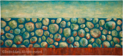
Iterations #2, 30 x 66 inches, ©2009 Deidre Adams
I finished this piece about a month ago, just before I left for Ohio (see images of the work in progress here and here). The commission was to make a copy of a work that had sold previously. The difference was that I needed to make the orange more red to coordinate with a swatch of fabric from some furniture that will be in the lobby area where the work will be hung. The swatch also has a kind of shiny copper look to it, so I put some metallic copper paint into the new one as well. I’m posting the original here again because it’s fun to see the comparison.
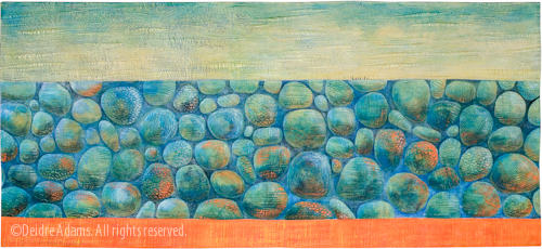
Iterations #1: Aquamarine, 30 x 66 inches, ©2006 Deidre Adams
While I was working on the color in the new piece, I was looking at an image of the old one on my computer screen in the studio and trying to make judgments based on that, but now that I see the photos together, I’m really surprised at how different the second one turned out. I knew the spaces between the stones were bigger and I had consciously decided that I wanted the negative spaces to be darker in this one, but the colors are more different than I expected, with a lot more contrast. I guess for me, making an exact copy turned out to be more difficult than I would have thought.
I delivered the piece just before I left town, and Judy and Kate from Translations both said they liked it better than the original, so that set my mind at ease. I hope the Ritz-Carlton likes it too.
Now, for another twist on this story. Translations moved into a new gallery space in the heart of Denver’s LoDo area last month. It’s a beautiful new space and the location offers much greater visibility and traffic potential than their old one. (They got a good write up in the Denver Post, which I meant to talk about here on my blog, but never got a response from the Post as to whether I could have permission to repost the photo, so I forgot about it.) A new customer came into the gallery and saw the work which was going to the Ritz-Carlton, which includes this piece:
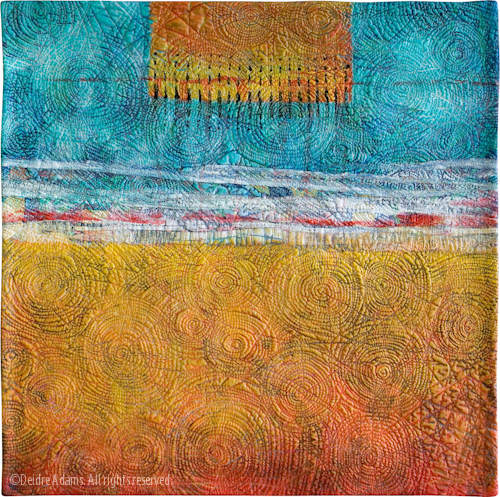
Horizon IV, 24 x 24, ©2006 Deidre Adams
She loved this one, and so now I have another commission to recreate an existing piece — except she doesn’t like yellow too much and wants me to make it more red.
Is it true that something becomes more desirable when it’s unobtainable? (Like that guy I broke up with once in my younger years but then wanted him back as soon as I found out he had a new girlfriend and was going to take her to the Bob Seger concert? Wow, dating myself here!)
It’s stunning!
This is lovely…but I love the original too! How nice that you get paid to rework a piece, adding new twists and seeing new dimensions!
Both of these pieces are extraordinary. However, I do like the greater contrast in the new piece. Looking forward to seeing the new commission and curious about how it will look different.
And, yes. When something is unobtainable, others will most definitely want it more. Bob Seger or not. Boy, he was HANDSOME back in the day.
Thanks, everyone. I have mixed emotions about the reworking. On the one hand, it seems too easy, but on the other, it’s harder than it seems.
I love Horizon IV.
I think your career and recognition as an artist will keep growing and you’ll be able to take or leave these requests soon — people will be clamoring for your pieces and you won’t have to do do-overs unless you want to.
(my psychic alter-ego Madame Elaine sees all . . . .)
Lainie, I have no doubt your vision is correct. I just need to be patient. 😉