Happy Father’s Day

adams-harryolsen-plane

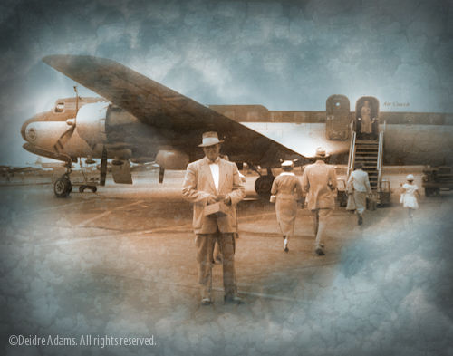
This is a photo of my grandfather. It came from an old square-format negative that was hanging around at my parents’ house for years, stuck in an envelope full of other such miscellaneous pieces of film that had long ago lost association with any known prints. My mother had always wanted to “do something with them someday.” At some point I acquired the ability to have negatives scanned, so she gave over the responsibility for this envelope to me. Some time later I did scan a lot of them, but a concrete idea of what to do with them never materialized. They were all taken long before I was born, and so I don’t know all of the people in them, but I do recognize my grandparents in some.

I always have a hard time figuring out what to do for my father on Father’s Day, partly because he lives in a different state and partly because, well, let’s just say we haven’t had the most traditional of father-daughter relationships. After my mother died a few years ago, we started talking on a somewhat more regular basis than at any prior time in my life. A couple of weeks ago, when I got an e-mail from iprintfromhome with an offer for a free 11 x 14 print, I got the idea that he might appreciate seeing this photo in print again. I needed to make the square into a rectangle, so I cropped the original and added some cloudy background stuff to impart a little drama and mystery. In the end, I liked my letter-size test print that I had made myself on my Epson R1800 better than the large one, so I put it into an 8×10 window mat to fit the 11 x 14 frame I had bought for it. Then I packed up the whole thing into a double box with lots of bubble wrap and sent it off, crossing my fingers that the glass doesn’t get broken in shipment. Hope he likes it!

June 21st, 2009|Miscellaneous|4 Comments

Ritz-Carlton commision finished

adams-iterations2-1

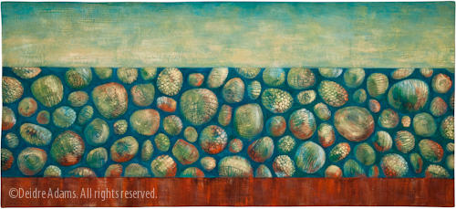
Iterations #2, 30 x 66 inches, ©2009 Deidre Adams

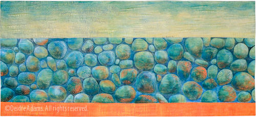
I finished this piece about a month ago, just before I left for Ohio (see images of the work in progress here and here). The commission was to make a copy of a work that had sold previously. The difference was that I needed to make the orange more red to coordinate with a swatch of fabric from some furniture that will be in the lobby area where the work will be hung. The swatch also has a kind of shiny copper look to it, so I put some metallic copper paint into the new one as well. I’m posting the original here again because it’s fun to see the comparison.

adams-iterations1-1

Iterations #1: Aquamarine, 30 x 66 inches, ©2006 Deidre Adams

While I was working on the color in the new piece, I was looking at an image of the old one on my computer screen in the studio and trying to make judgments based on that, but now that I see the photos together, I’m really surprised at how different the second one turned out. I knew the spaces between the stones were bigger and I had consciously decided that I wanted the negative spaces to be darker in this one, but the colors are more different than I expected, with a lot more contrast. I guess for me, making an exact copy turned out to be more difficult than I would have thought.

I delivered the piece just before I left town, and Judy and Kate from Translations both said they liked it better than the original, so that set my mind at ease. I hope the Ritz-Carlton likes it too.

Now, for another twist on this story. Translations moved into a new gallery space in the heart of Denver’s LoDo area last month. It’s a beautiful new space and the location offers much greater visibility and traffic potential than their old one. (They got a good write up in the Denver Post, which I meant to talk about here on my blog, but never got a response from the Post as to whether I could have permission to repost the photo, so I forgot about it.) A new customer came into the gallery and saw the work which was going to the Ritz-Carlton, which includes this piece:

adams-horizoniv1

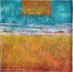
Horizon IV, 24 x 24, ©2006 Deidre Adams

She loved this one, and so now I have another commission to recreate an existing piece — except she doesn’t like yellow too much and wants me to make it more red.

Is it true that something becomes more desirable when it’s unobtainable? (Like that guy I broke up with once in my younger years but then wanted him back as soon as I found out he had a new girlfriend and was going to take her to the Bob Seger concert? Wow, dating myself here!)

A visit from artist Isabelle Wiessler

wiessler-spurdersteine

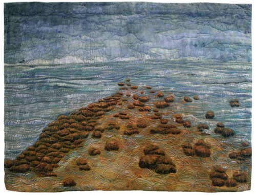
Die Spur Der Steine, 74 x 90 cm (29 x 35 inches), ©2008 Isabelle Wiessler

By far the most interesting aspect of keeping a blog is meeting new people, both nearby and from the other side of the globe. It has opened up a whole new world for me, mostly online, but sometimes in person.

This week I was fortunate to have a studio visit from a friend I met through my blog. Isabelle Wiessler, an artist from Gundelfingen, Germany, and her husband were travelling to the U.S. to visit her daughter, who is working in a nearby town, and to see some of the sights in Colorado and neighboring states. She e-mailed me before coming over, asking if I ever had open studios. I don’t live in an area with many other artists, so I’ve never had an open studio, but I replied that I would be happy for her to just come for an informal visit some time while she was in the area.

I was somewhat apprehensive as to what I would talk about, since I’m not the most outgoing of individuals. But it turns out I need not have worried, because Isabelle is warm and friendly and genuinely interested in everything relating to textile art.  We had a lovely conversation about our different working methods as I showed her my studio setup and my work. I also learned something more about what it’s like to be a textile artist in Europe versus here in the United States. We here are very fortunate to have so many opportunities to exhibit our work.

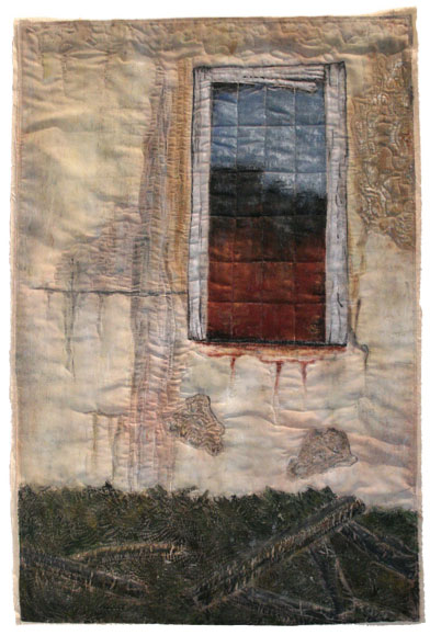
wiessler-verfall

Verfall, 70 x 104 cm (28 x 41 inches), ©Isabelle Wiessler

While I was looking at her web galleries, I was especially struck by this image. It looks like something I would have photographed myself if given the chance. Isabelle uses a lot of different materials in her work, including Tyvek and Lutradur, as well as dyeing her own fabric. She also includes a lot of embroidery and handwork. Beautiful!

(Images posted with permission of the artist.)
June 11th, 2009|Inspiration|5 Comments