Going with the flow … or is it more of a backwater eddy?
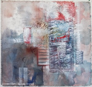
Untitled, 12 x 12 inches, ©Deidre Adams
When I finished up my spring semester of school back in mid-May, it seemed I had the whole summer before me and many grandiose plans swirled through my brain about all the great work I was going to make and the many things I would accomplish. Well, here it is the middle of July and I don’t have a whole lot to show for it. Instead of going into my studio and working full days with single-minded focus, I’ve found that my time has been thoroughly eaten away with traveling and design work, and artwork time has been limited to popping in for short stints when I just couldn’t force myself to sit at the computer for one more second.
This kind of disjointed time is manifesting itself in serious ADD behavior. Instead of concentrating on a single thing, I’m flitting from one project to another, making small amounts of progress on each. I’m working on a few large pieces in my standard working style, progressing very slowly. It seems the large pieces now require small amounts of painting interspersed with lots of staring and contemplating and decision-making. In addition to those, I’ve also started some totally new small works that I have a vision will contain lots and lots of hand-stitching, something I love but rarely find time to do. And since I’m not distracted enough, I’m getting out UFOs (unfinished objects) and finding little ways to improve them. I’m even taking a few of my older finished pieces that I wasn’t satisfied with and have been making small alterations.
This piece above started as a school assignment. It was part of my final project in Painting IV last spring, which was supposed to consist of 2 large paintings. Since I was taking a total of 5 classes, I knew that I was not going to have a lot of time to complete the work at school. Plus I really did not want to have to schlep huge canvases back and forth to school and home for each class. In consultation with my instructor, we agreed that I could make 6-8 small pieces instead of the 2 large ones. At the time, I had been reading Elaine Lipson’s Red Thread Studio blog, a content-rich source of ideas and links relating to all manner of sewing topics, and from there went to a link for the Sri Threads blog, specifically this post about a boro sakiori noragi, an old Japanese work coat that was well worn and loved and had been patched many times. I loved the story of how it was made:
Sometimes a group of women would pool their meager resources to buy a bundle of rags. They’d sort the rags, wash them and then prepare them for use as yarn to create these thick coats. Prior to this, farmers and rural folk would wear what they could forage for and turn that into yarn, so they wore clothing of hemp, ramie, wisteria and the like.
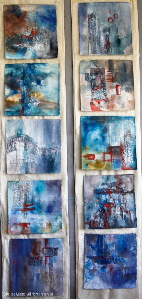
The Sri Threads Gallery has many more examples of these patched textiles on their web site, and I printed out some of them for the “process folio” we’re required to make for every painting assignment. The beautiful stitching was so engaging to me, along with the idea of continuing to repair and keep using an item of clothing, instead of casting it away so easily as our society does. So I had some kind of idea that my pieces would be about wabi-sabi, or finding beauty in the imperfect. I knew that I wanted to include scraps of cloth and hand stitching as an homage to this way of thinking and living. Here’s an image of them in progress:
The top ones are before any paint is applied, and the bottom ones are in early stages of painting.
The problem was, I ran out of time and was just going through the motions there at the end. I couldn’t figure out how I could possibly give them the kind of dimension I wanted them to have, plus get them all mounted so they would look complete, but at the same time preserve the raw edge of the torn canvas, which I deemed as very important to the work. Since having something you could call finished seemed to have a bigger impact on your grade than whether or not you realized your artistic vision — after all, how could anyone besides the artist really know whether that was achieved — I had to compromise. I ended up making 2 long, banner-like mountings out of canvas and batting, and I laboriously hand-stitched each of these little paintings to them to form long vertical pieces. This image shows them close to done but without the final dark paint that I ended up putting on the background. I forgot to take a picture of the completed paintings — I guess that in itself is an indicator of how excited I was about it.
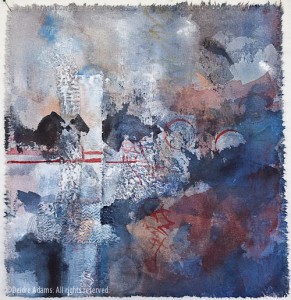
Well, these things have been hanging around my studio for months, and I finally got tired of looking at them. I just decided to take the plunge and cut them all apart again, to live as separate paintings as I had intended all along. I’m giving up on the idea of simple beauty, because they were, quite frankly, just plain boring, and that original idea is less important to me than having work I find interesting and complete. I’m working on making them standalone paintings, with texture and color and many levels of layering. I’m much happier with where these are going now. Here are a couple more:


