Overcoming attachment
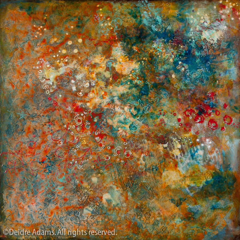
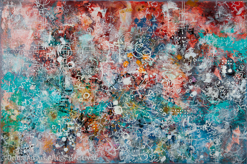
Deidre Adams-Organic CompoundOrganic Compound, 24 x 24 inches, acrylic on panel, ©2010 Deidre Adams

I’m finally calling this painting done. Not that I haven’t already done that – twice – but I kept thinking it needed something more. I went to a meeting of artist friends on Friday night, and the next day, while thinking about a conversation we had with the hostess while considering a painting in her studio, I was inspired to attack my own painting one more time.

My friend had made her painting over the course of a 15-week class in which the students worked on the same painting in each session of the class. I had seen my friend’s painting once before in a much earlier stage, and I was really surprised at how much it had changed by the end – I wouldn’t even have recognized it as the same painting. The final painting was fantastic, but I’d also thought the same thing about the earlier version. I asked her if it had been difficult to paint over parts of the painting that were really working. She talked about how it was part of the process to let go of attachments and learn to forge ahead without fear.
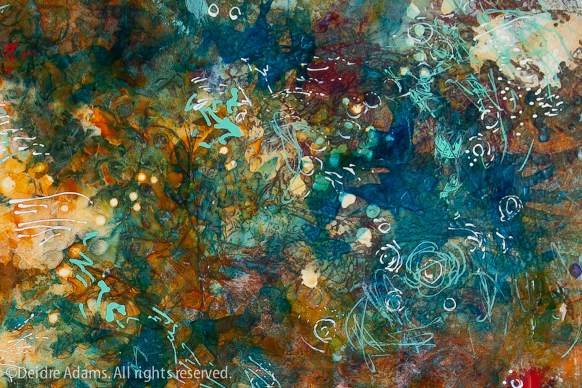
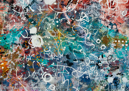
Deidre Adams - Organic Compound-detailOrganic Compound, detail

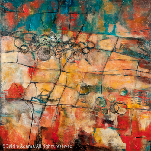
The notion of attachment really resonated with me, as I do have a tendency to fall in love with certain passages in a painting, and then the fear of messing with those keeps me from giving the painting what it needs. The image below shows the last documented state of Organic Compound before the above. I was really happy with the colors and textures, but the composition was just a little too “overall” for me and I felt it needed some punch. So my solution yesterday was to add the darker blue values in the upper right corner, plus the very detailed turquoise markings. In the process, I lost some really nice color and detail in that upper right area, but in my opinion the resulting composition is a lot stronger now.
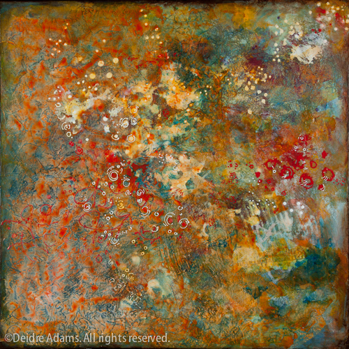

Organic Compound in progress II

Prior to that, the painting had a very different look. Below you will see how it looked for several months. I was really indecisive about where to go with it, so I just decided to make a drastic change and see where that would lead. I flooded the whole thing with warm reds and oranges, which settled very nicely into the texture and made a more cohesive result. It also changed the balance, so I rotated it one turn. (Topic for future discussion: Those who say you must be decisive in choosing the orientation vs. those who say it’s subject to change.)

Some of you may not agree that what I did was an improvement. Of course it’s my work so I have final say, but I am curious to know what you think.

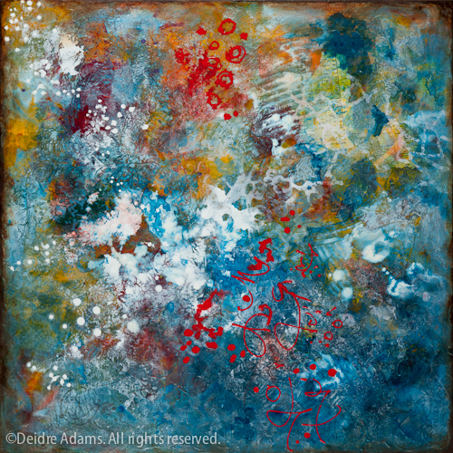
Organic Compound in progress I
January 30th, 2011|Painting, Process|11 Comments

More thoughts on “meaning”

Orthographic Rule, 24 x 36 inches, acrylic on canvas, ©2010 Deidre Adams

While considering the comments regarding my last post on the topic of meaning, it dawned on me that I never did post my final thesis statement written for my BFA exhibition, although I did go on about it at length. While my focus has become somewhat more broad in the latest work, much of what I said is still applicable, so it’s a good follow-up to my last post.

Deidre Adams

Plane of Persistence

BFA Thesis Statement

Minutes, days, months, years — the perpetual cycle of time and the seasons both creates and destroys; it both hides and reveals. As man seeks to build, nature seeks to reclaim. Plane of Persistence captures the essence of the seductive surfaces created by this unpredictable, uncontrollable process. Abstract in form, each of my paintings is a personal meditation using the formal elements of visual language, specifically line, shape, color, scale, and balance. Texture is a primary focus, and I add marks and washes of color in layers, building a literal record of all the stages in the process. Language is evident but reduced to its essence, communicating only the need for obsessive mark-making. The visual nature of the work, displaying aesthetics of decay and decomposition, is my intuitive response to a society becoming ever more preoccupied with the manufactured and the mass-produced, the over-loaded and over-consumed.

Plane of Persistence makes reference to time and transformation, specifically to the ways in which surfaces are altered by external forces. Oxidation, cracks, watermarks, scratches and scrawls made by the human hand — these are the vestiges of change that inspire my process. My method of layering and my system of mark-making emulate the process of natural transformation. Organic in personality, my vocabulary of marks consists of dots, dashes, lines, or circles, or may sometimes appear to be a secret language that’s familiar, yet remains unintelligible. I work in an intuitive process of personal discovery, first placing objects and shapes on the surface, then using these as a catalyst for response. Elements are added in layers as I continuously adjust the composition to balance harmony and chaos. Mindful of the picture plane, I work to maintain tension between flatness and depth. Textural elements added to the surface intensify this spatial ambiguity while serving as focal points within the composition.

I find inspiration in Eastern philosophy and the accompanying approaches to art-making, specifically Zen ideas of the “empty” or “open” mind, of mindful awareness, which emphasize trusting in the process while leaving one open to new creative possibilities. Also important is the Japanese concept of wabi-sabi, which stresses the value of finding beauty in the imperfect and the impermanent, while accepting the natural cycle of life, decay, and death.

Plane of Persistence pays homage to forces greater than myself, while the working process allows me to find a quiet place within. Even as the decisions I make while painting are an attempt to control the result, there is still an element of chance that makes the outcome unpredictable, much like life itself. Despite all our efforts to conquer nature and the elements, we are still subject to forces we cannot control.

Disclaimer: While this was written for an academic situation and I would never write anything this long and formal for any situation I can envision now, I have to admit I was pretty proud of myself when I got it done.

Orthographic Rule (detail), ©2010 Deidre Adams
December 22nd, 2010|Painting|2 Comments

Homage to Diebenkorn

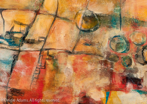
Sidewalk (Homage to Diebenkorn), 38 x 38 inches, acrylic on canvas, ©2009 Deidre Adams

This painting recently came back home to me from a temporary exhibition at the Colorado State Capitol, in the office of the Colorado State Speaker of the House, Terrance Carroll. Along with the work of other Metro art students, Sidewalk was one of two of mine chosen by the Speaker for display at the Capitol. Back in April, I posted a photo of the other one here. Sidewalk was done for an assignment in my Painting IV class. We were supposed to do a painting in the style of one of our favorite artists, but make it our own. I chose Richard Diebenkorn. There are many reasons I’m drawn to his work, but perhaps one of the strongest is an affinity I feel for the work he did while he was in Albuquerque, my home town. The colors and shapes speak to me of something I can’t name, but having lived there for the first 21 years of my life, is a part of me as surely as my own skin.

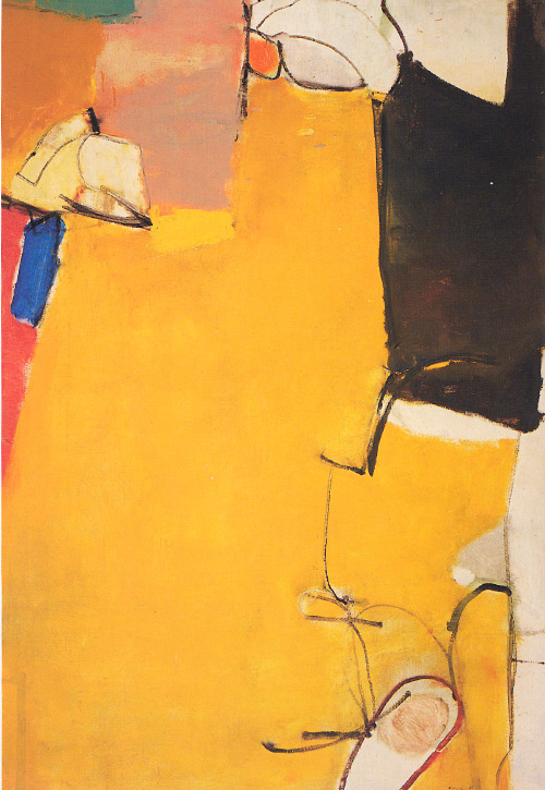
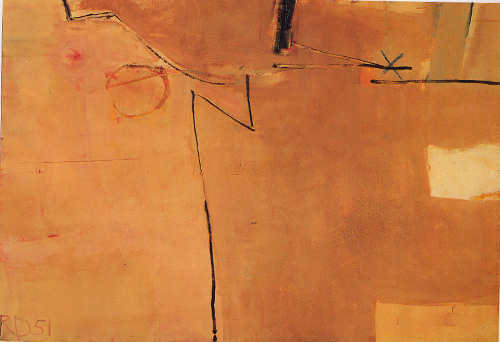
Richard Diebenkorn, Untitled (Albuquerque), 55 x 35 inches, 1951.

Richard Diebenkorn, Albuquerque, 38 x 56 inches, 1951.

The divisions of the space remind me of my beloved walls, and the colors of this second painting must surely be inspired by adobe, ubiquitous in New Mexico. I love the use of line with the bold, flat areas of color. While Diebenkorn is better known for his later work, especially the Ocean Park series, I find his earlier work more interesting. It has a freedom and movement not seen in his work of the 60s and 70s.

Richard Diebenkorn, Sausalito, 1949.

More of his New Mexico works can be seen here, and in the book, Richard Diebenkorn in New Mexico.

With Sidewalk, I wanted to try bringing some texture into the work. I was experimenting with adding joint compound and texture gels to the paint.

Sidewalk (Homage to Diebenkorn), detail, ©2009 Deidre Adams

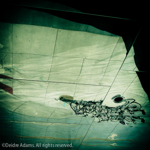
I was working from a photo I had taken earlier, not specifically for the purpose of turning it into a painting, but I just liked it.

Bicycle Rack, ©2008 Deidre Adams

At the MCA Denver, the upper section of the building juts out from the lower section. The surface of the overhang is a reflective metal in which you can see reflected a bicycle rack on the sidewalk outside. I’ve always loved this image for its strange combination of familiarity and ambiguity.

December 15th, 2010|Influences, Painting|Comments Off on Homage to Diebenkorn