Robert Ryman – White paint, not white paintings

Ryman - Surface Veil

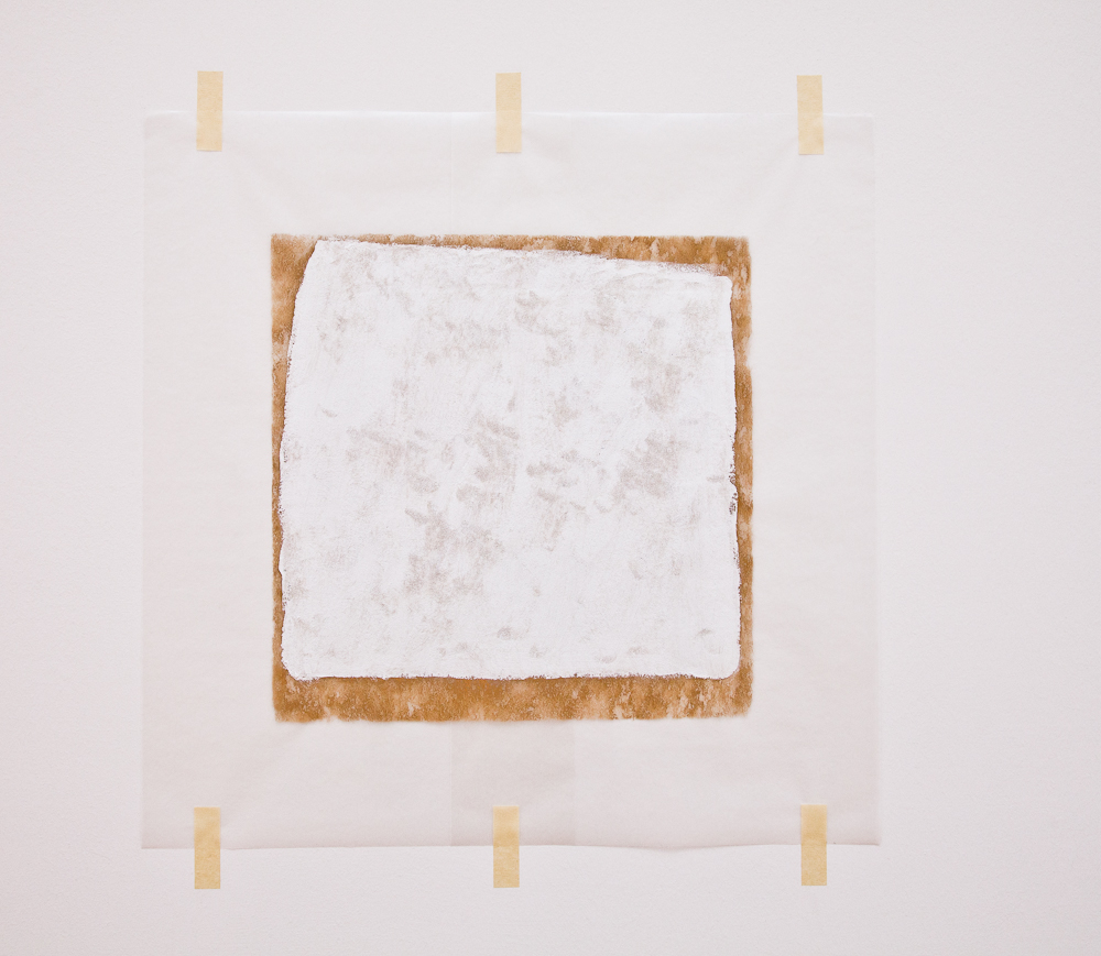
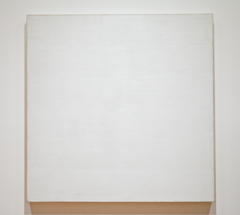
Robert Ryman, Surface Veil, 1970-1971
22 x 29 inches, oil on fiberglass with waxed paper frame and masking tape. Collection SFMOMA.

“The real purpose of painting is to give pleasure.”
–Robert Ryman

When one’s thoughts turn to the topic of white paintings, artist Robert Ryman comes easily to mind. Ryman, born in 1930 in Nashville, was first a jazz musician until he moved to New York in 1952 and subsequently took a job as a vacation relief guard at the Museum of Modern Art. His exposure to the artwork there, including contemporary Americans Jackson Pollock, Willem de Kooning, and Mark Rothko, was instrumental in his decision give up music and turn to painting. He never had any traditional art training, although, as Suzanne P. Hudson recounts in Used Paint1, he was directly influenced by MoMA’s “widespread institutional ethos of experiential learning whereby museum educators … promoted values of thinking and making ‘outside the lines.'” He took one adult course at MoMA in experimental painting, although he would later say he didn’t remember much of it. Other than some life drawing done in the class, he never went through the traditional stages of learning to paint or draw representationally. Instead, he was interested in discovering what could be done with different kinds of paints, substrates, and other materials.

Ryman - Painted Veil (detail)
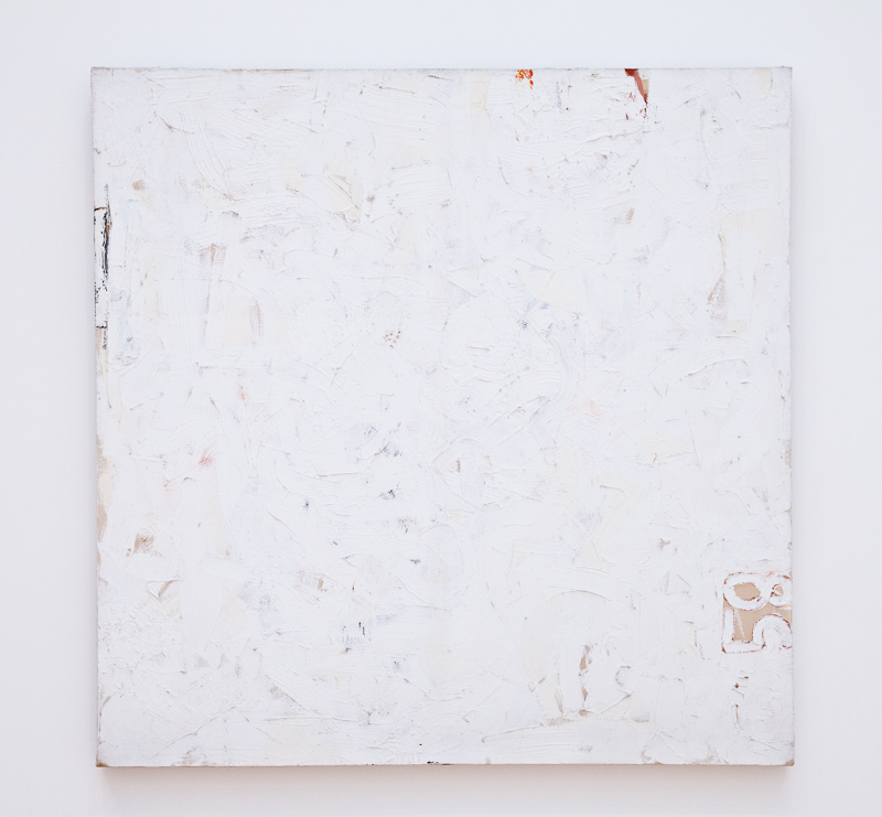
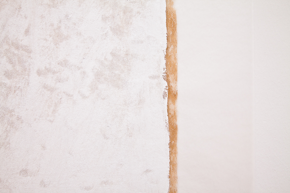
Robert Ryman, Surface Veil (detail)

Although beginning in the mid-1950s he spent many years exclusively making paintings with every type of white paint, using a seemingly limitless variety of techniques on every possible surface, and he is known for work most commonly described reductively as “white squares,” he would say that he was not making white paintings. “I never thought of white as being a color. White could do things that other colors could not do. White has a tendency to make things visible. You can see more of the nuance.”2

Speaking of one of his earliest works, Untitled (Orange Painting), he said in 1992, “I’ve always thought that if I ever wanted to paint a white painting it would be in the order of the way this painting was done, because this is definitely an orange painting but there are many nuances and many oranges (and black and green). And if I were doing a white painting I would approach it the same way, and there would be whites and warm-whites and cold areas and then you would have a white painting. As it is, the way I use white it’s more as a neutral paint, in order to make other things in the painting visible, color for instance.”3

Robert Ryman, TwinRobert Ryman, Twin (1965)
6′ 3 3/4″ x 6′ 3 7/8″ Oil on cotton. Collection New York MoMA.

The interesting thing about Ryman is how he became so well known in spite of (or because of?) his unapologetically unconventional approach to painting. He confounded the critics, who tried variously to categorize his work as minimalist, or anti-form, or process, or conceptualist, while admitting that none of these could be perfectly applied. He resists the idea that his work is abstract, saying “I don’t abstract from anything.

[My work is] involved with real visual aspects of what you really are looking at, whether it’s wood, or you see the paint, and the metal, and how it’s put together and how it works with the wall and how it works with the light.”

Robert Ryman - Untitled (1958)Robert Ryman, Untitled (1958)
10.125 inches square, enamel on linen. Collection SFMOMA.

He also resisted attempts to place him into a specific box or frame within the greater art world. “I’m not involved with any kind of art movement. I’m not a scholar, I’m not a historian. I just look at it as solving problems and working on the painting and the visual experience.”5 There is no attempt at illusion; the paintings are not “about” anything other than what’s right before your eyes. What you see is what you get – nothing more, nothing less.

I read parts of Used Paint a couple of years ago when I was doing research for a school project. It was a treat for me soon thereafter to be able to go to the San Francisco Museum of Modern Art and see some of these paintings in person. They are just what you’d expect, but somehow in person they have a surprising presence. I’m drawn to Ryman’s work aesthetically, and I admire his ability to put forth these seemingly simple objects as paintings and get them hung in the most prestigious of museums. I have an impressive number of partially finished textile works lying around my own studio, suspended from completion because I love the raw edges and I don’t want to cut, bind, or hide them in some “professional” way. If I were Ryman, that would be the end of it – I’d just hand them over to the Guggenheim and up they’d go as is.

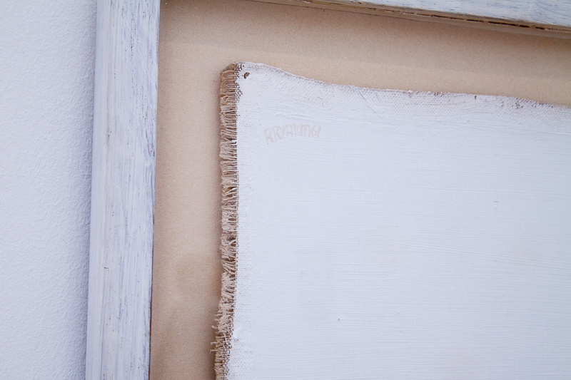
Robert Ryman, An all white painting measuring 9 1/2 ” x 10″ and signed twice on the left side in white umber
(See full view here)


I first became aware of Ryman’s work from the wonderful PBS art:21 series. In this video from Season 4 (2007), Ryman demonstrates how his paintings consist not only of the support and the paint, but also the edges, the fasteners, and the wall itself. He tapes panels to the walls with blue painter’s tape, and then paints right over the tape and onto the walls beneath the panels. Then the tape, which has functioned as a resist, is removed. The process is repeated multiple times. This creates a variance in the surface and edge surrounding each panel. The quality of the light in the room is extremely important to the aesthetic experience, including how it changes throughout the day. Speaking about his intention, Ryman says, “It should be a soft, quiet experience that’s nice to look at.”

“In painting, something has to look easy even though it might not be easy.”
“The painting should just be about what it’s about, and not other things.”
“In all of my paintings, I discover things; sometimes I’m surprised at the results6


1Suzanne P. Hudson, Used Paint (October Books, 2009) 7.
The title of the book comes from an anecdote Ryman tells. In 1968, he was to have an exhibition at the Konrad Fischer gallery in Dusseldorf. In order to minimize customs fees, Fischer listed the shipment as “paper” instead of “art.” The customs official said that the duty on handmade paper would be expensive, so Fischer told him it was used, and the paintings were shipped with the designation “Used Paper.” Ryman says, “Since that time I have wondered about the possibility of paintings being defined as ‘Used Paint.’ Then there could be ‘Used Bronze,’ ‘Used Canvas,’ ‘Used Steel,’ ‘Used Lead … ‘”

2Robert Ryman in “Paradox,” segment from PBS series art:21, Season 4.

3Ryman, cited in interviews with Catherine Kinley on April 11, 1992, and Lynn Zelevansky on July 1 and 7, 1992. See Catherine Kinley, Lynn Zelevansky and Robert Ryman, “Catalogue Notes,” in Robert Storr, Robert Ryman (ex. cat., Tate Gallery, London/MoMA, New York, 1993), p. 48, quoted in “The How and the What,” Suzanne Hudson, Flash Art n.263 November-December 09

4Ryman, “Paradox”

5ibid.

6ibid.

January 19th, 2012|Art, Interesting Artists|4 Comments

Nancy G. Cook – Seed Play

Echoes of Tulips Summer, 36 x 36 inches, ©Nancy G. Cook

Nancy Cook is a North Carolina artist whose work I first became aware of a couple of years ago when I saw her piece in the SAQA 20th Anniversary Trunk Show. Titled Ankle Twister II (photo here), it was a tiny gem of a quilt that captured my attention in a big way. Nancy has been working with the quilt medium for 16 years, but she has really found a unique voice with her Seed Play series. She invites us to take a closer look at the exquisite details of seeds, pods, and fruits, whose subtler color is often overlooked in favor of the plant’s showier flower, but whose form is just as interesting if not more so. Nancy’s reverence for nature is evident in her lively composition, ethereal colors, and mesmerizing quilting lines.

Echoes of Tulips Summerdetail

The focal point of this quilt is the seed pod of the Tulip Poplar. Nancy says,

[It] shatters as the birds feed upon it. It will also hold some of the seeds from one year to the next. So you can find buds, flowers, this year’s seed pods, and last year’s seed pods on the tree all at the same time. The little seed stitches on the spike of the pod are where seeds have already fallen off the pod.”

Nancy left her career in organizational development and psychology to become a full-time artist in 2001. With more time to concentrate on her work, she was able to focus on her love of the outdoors in combination with her art. She says,

“I find the interconnected web of life to be endlessly fascinating, and I like working with one small piece of it to unravel some of the wonders. Recently, I have been working on a series that features tree seeds as symbols of the gifts that come with life’s maturity. I learned that my work was autobiographical when I noticed that I was creating autumnal images at the same time that I was aware that I came to my art in the autumn of my life. Fortunately, it seems to be a Southern autumn that is prolonged.”

Kousa: A New Dogwood in Town, 36 x 36 inches, ©Nancy G. Cook

Nancy’s heightened awareness of issues concerning nature and trees is a frequent source of inspiration for her work. Kousa: A New Dogwood in Town was inspired by the passing of one species in decline while another takes its place. She says, “Our native dogwood is succumbing to a viral infection across the country. In its place, the Asian Kousa Dogwood is being grown as it is resistant to the infection.”


Mockingbird’s Larder36 x 36 inches, ©Nancy G. Cook

“Mockingbird’s Larder is a deciduous holly. The Mockingbird carefully guards a food tree like this throughout the winter until either the Cedar Waxwings or the Robins descend in large numbers and strip off the berries and move on.”

Mockingbird’s Larderdetail

There are several things about this piece that I find intriguing. First, I love the way the darker areas of the hand-dyed background fabric echo the character of the tree branches, bringing a strong unity to the work. Second, Nancy has added depth and dimension by using hand embroidery to create the finishing details. And finally, in an unexpected and lovely master stroke, she has engaged the viewer by leaving some of the berry shapes unpainted, indicated only by quilting lines.

Nancy’s career is really taking off this year. She will have no fewer than three solo exhibitions and a featured artist exhibit in botanical garden and art center galleries over the next 12 months. She has also been selected as a featured artist in  Art Quilt Portfolio: The Natural World by Martha Sielman, to be published in 2012.

You can learn more about Nancy and see more of her work on her web site, and keep up with her work and exhibitions on her blog.

February 9th, 2011|Interesting Artists|Comments Off on Nancy G. Cook – Seed Play

Leslie Tucker Jenison

Edge of Information: A Cityscape of Paper & Cloth, 48 x 36 inches, ©2009 Leslie Tucker Jenison

Last summer, when I was in Ohio for the taping of Quilting Arts TV, I had the pleasure of meeting several artists who were also there to tape various segments on their own work. One of these was Leslie Tucker Jenison, a lovely and talented artist from San Antonio, Texas. I didn’t realize it when I met her, but after I got home, it hit me that she was the creator of  Edge of Information: A Cityscape of Paper & Cloth, from SAQA‘s Creative Force exhibition, a quilt I loved so much I decided a detail of it needed a full page in the intro of the catalog.

Edge of Information: A Cityscape of Paper & Cloth (detail), ©Leslie Tucker Jenison

Intrigued by the idea behind this piece, I contacted Leslie to ask her about the work. She was very generous in sharing her process with me. The quilt is constructed of cotton/bamboo, cotton/silk, cotton broadcloth, and Lutradur. It also features various kinds of paper from books, magazines, newsprint, and shredded junk mail, all stabilized with matte medium to seal and stabilize against potential problems with acid content in the paper. She explains how her original idea was transformed during the process:

I was creating a quilt for a themed exhibition. I spent about a month using dye, soy-wax batik, screen-printing, and other surface design techniques to create many yards of cloth and paper for this quilt, thinking I was working toward an abstract winter landscape. The piece wasn’t coming together in a satisfying way, but still I pushed forward. One night, I had a dream about a very different quilt using all this cloth & paper. This had never happened to me before (or since, unfortunately!); this quilt would be a different sort of landscape: a city skyline. I dropped the other construction and began working on the piece that eventually became Edge of Information. The quilt came together very quickly once I got on track. Edge of Information: A Cityscape of Paper and Cloth is the first large piece that I created using both cloth and paper.”

Artists come to fiber art from many different backgrounds, but I think Leslie is unique in that she has been both an RN and a pilot. I asked her if either of these things provided an influence for her current work, and she said, “Without question!” Once I heard how these things relate to her work, it’s easy to see the inspiration. She says,

I love the juxtaposition of microscopic to the overt. I adore all things skeletal: I find bones to be very sculptural, with fascinating contours and negative spaces. To me, the inside of the human body is as beautiful and interesting as the outside.

I have spent many hours flying over the landscape, particularly in the midwest. Topographical details of the landscape, crop patterns, river courses, etc., have greatly influenced my quilting style.

Leslie says her best work comes from experimenting in the studio. She doesn’t plan extensively when making a piece, but she begins with an idea and allows the work to evolve while working out the details of how best to interpret and convey the subject.

Her recent large quilt, What Remains, a piece about the aftermath of the earthquake in Haiti, is another example of how she works to express the idea.

What Remains,  ©2010 Leslie Tucker Jenison

The quilt was created using print media about the earthquake, laminated to polyester sheer, along with cloth created to resemble industrial-looking building materials. The base is constructed of many layers of felt and cloth to create a dimensional effect. Leslie describes her thoughts about making the work:

Specifically, I was thinking about the strata of the rubble: all the everyday items layered in between building materials. I thought about how these images are shown to us so frequently that we almost become immune to the horror of the tragedy. Then, it becomes yesterday’s news. I did a great deal of writing on this piece both by hand and sewing machine, and it’s incorporated into the quilt. The quilt is quite raw and disturbing to look at, and that was my intent.

This quilt was part of the special exhibition Beneath The Surface in Houston at the International Quilt Festival.

November 23rd, 2010|Interesting Artists|3 Comments