Early influence – Nancy Crow

adams-strata-ii.jpg

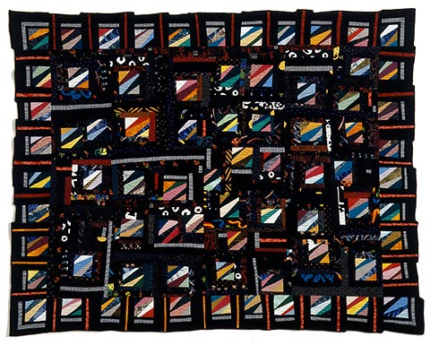
Strata II, 48 x 60 inches, © 1999

As part of our work for the Distinctive Directions show, each artist agreed to write about why we work in a series. As I was trying to tell my story in that regard, it got me thinking back to my experiences in Nancy Crow’s workshops. These were some of the first art-quilting classes I had ever attended, and it was a sink-or-swim type of environment. Nancy’s dedication to her work is legendary, and she expected a lot from her students. Those who were willing to rise to the challenge got a lot out of it. There were some who found it a little too intense, and rumor has it there were even some tears shed on occasion.

For me, it was an eye-opening experience. Up until that time, I had only just been dabbling a bit with trying to make my own experimental variations on traditional quilt patterns, but still stuck in the rigid ruler-and-rotary-cutter world. Nancy showed us how to cut freehand, stitch odd shapes together, and use a design wall to design improvisationally. She also taught us to take our work seriously and introduced us to the idea of working in a series to fully explore our ideas. In the first class, called Sets & Variables, we had to take a single motif and do several different variations on it. I made a lot of pieced quilt tops from these exercises, but Strata II, above, is the only one that I ever finished. Most of the motif blocks were made in class, but when I got home I wasn’t happy with how they looked just butted together. So I added the black & white striped fabric to make a counterpoint to all the wild colors. I can see some things in it that I would do differently now, but it was a pretty big breakthrough for me at that time.

I also loved the outside edge that was formed by all the differently-sized blocks, and so I was pretty proud of myself when I figured out how to finish the edge with a decorative overlock stitch that I could make with the Pfaff 7550 I was using then.

January 30th, 2008|Influences|6 Comments

Goals and intent

Colorways II detail
Colorways II (detail) ©2005

My friend Lisa Call is without a doubt the most productive person I’ve ever met. Not only does she make sumptuous art quilts with an outstanding use of understated color, but she does it with a singular focus and drive that are unrivaled by anyone I know.

I’ve been in a couple of critique group situations where the talk has turned to goals. When this has happened, I’ve always kind of shrunk into the background hoping nobody will turn to me and say, “Hey, so just what exactly are your goals?” and thus in that exact moment expose me for the fraud I am. The thing is – I’m just not a goal-oriented person. Having sat through more than one presentation on marketing for artists, I am aware that I should have meaningful, quantifiable, and reasonable goals. But so far, the only thing this idea has gotten me is a large unhealthy dose of guilt because I am obviously not doing everything an artist should do.

My goals are vague: get into the studio and make some work, get the web site updated (ahem), make up a batch of portfolios and get them sent out to some as-yet undetermined destinations that will jumpstart my career, etc. These are things that I keep in the back of my mind. I would never formalize them by writing them down (except that I just did). I know that as goals, these are way too vague to be useful, but I just don’t care.

That’s why I was so excited to read Lisa’s recent posts about intent – Transitioning and Holding Intent – Part I. The idea that you can just go into your studio and simply focus on creating – without having some higher guiding purpose or end result in mind – is liberating. For me, studio time has always been a reward, not something I feel I have to do. Since it’s one of the most enjoyable aspects of life for me, I always kind of feel like I need to have a justification for it. “Oh, I have shows coming up that I need to make work for.” While often true, why do I feel like I’m making excuses for some unseemly addiction?

Perhaps deep down inside, I feel like this lack of goal-setting capability means that I’m not properly dedicated to my art, at least insofar as others might see me. (Plus, with all that needs to be done in the world, do I really deserve to be able to take this time just for me?) But I am doing what makes me happy, and with the support of my family and more than a little luck, I’ve been able to take it much further than I once would have thought possible. Some day, I’ll really buckle down and get to work on accomplishing those goals, honest! For now, though, I have to concentrate on the work itself.

The photo above is a detail of Colorways II, one of a series of four works installed at Kaiser Permanente in Highlands Ranch, Colorado. This is a reminder of another unmet goal: get over there and get a good installation shot for my web site.

January 25th, 2008|Career and focus|8 Comments

Found art

adams_abstract-2.jpg

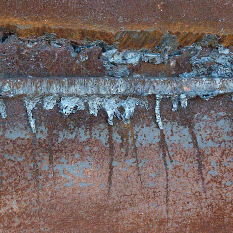
Composition in Blue and Sienna
© 2003

My obsession with working abstractly has probably been fed by two things over the years: one – working with the quilt medium, which, if done with traditional patterns, involves working largely with geometric shapes, and two – if I can be honest here – the fact that I’m not too great at drawing or painting realistically. All that notwithstanding, however, I find I much prefer to look at abstract art rather than realistically painted scenes. But I’ll leave the whys and wherefores of that preference for a later date.

My real point here is that once you get into the habit of seeing, you realize that abstract compositions are all around you, until finally you get to the point where you can’t not see them. The above photo was taken at a construction site several years ago. Unfortunately, that was long before I had any ideas of writing a blog, and I was not in the habit of taking detailed notes about what I was photographing. So I’m not totally sure what this was – maybe the side of a vehicle or a container of some sort. I was making pictures of things that I thought might turn into compositions or possibly become elements for photomontage work. I have not done any Photoshopping on this image other than cropping it into a square composition.

I would like to think of some kind of a creative name for my series of similar images and possibly publish them as limited edition prints. But what would be a good name? “Found art”? “Discoveries”? “Serendipity”? Hmmm … keep thinking …

I’m not alone in my taste for what makes a great image. Check out these great photos by the very talented Jeanne Williamson. Amazing shades of blue!

January 20th, 2008|Inspiration, Photography|4 Comments