About Deidre Adams

This author has not yet filled in any details.
So far Deidre Adams has created 258 blog entries.

A new look

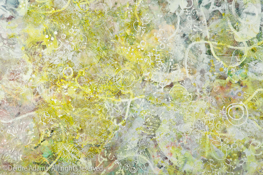
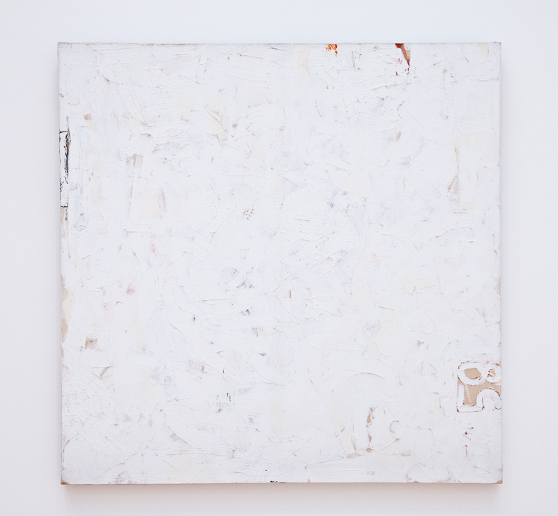
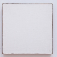
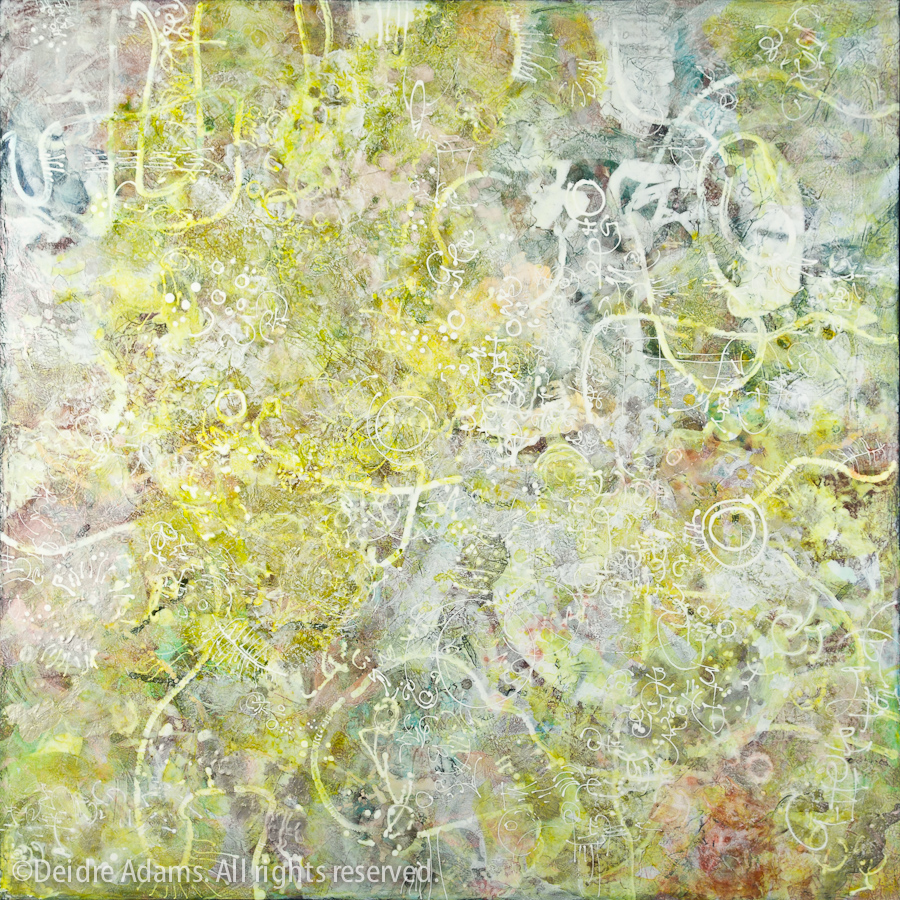
Deidre Adams - SchemaSchema, 20 x 20 inches, acrylic on panel, ©2012 Deidre Adams

At long last, I’m happy to announce that my web site revamp is complete. It was a long struggle, started over a year ago and subject to many changes of course throughout the process. I had a very specific set of requirements in mind for my site, and it took me a long time to settle on a set of tools to accomplish it.

My old site was done through a combination of a Lightroom export template and a lot of hand coding necessary to coax all the pieces and parts to behave the way I wanted them to. The problem with this approach is that if you don’t work in HTML and CSS every day, you kind of forget the specifics of your particular mechanics in the long spaces in between updates. That meant my site was very hard to update with new work, and adding new pages was a somewhat laborious process.

This new site is built with WordPress, which I was already using for my blog but not the website itself. The challenge here was how to combine the web site with my blog, which I wanted to keep at the same URL so as not to interrupt any good karma I might have had going with that. This required the expert technical skills of my always handy husband (thanks, Joe!) whose many talents include coding expertise along with frame-building, waffle-making, and all-around general know-how for fixing stuff that breaks.

WordPress uses templates, which are lovely and magical for getting the pages and posts to look great without having to have any great degree of coding genius. I wanted thumbnail galleries for my images, so I looked at a lot of templates that provided them. Most had some issue or other that made them less than ideal. I finally decided to go with Photocrati, a template designed for photographers, which includes a lot of very impressive features. It’s $89 (it was $79 when I first purchased it), which may seem like a lot, but it’s been worth every penny both because of how easy it makes updating and modifying, and because of the excellent tech support they provide. I needed to do a lot of customization to get things to look the way I wanted, sometimes necessitating diving into the code, and sometimes I needed help with that. They have a very good online help site, and I also contacted them numerous times and received very friendly and helpful advice from the email support staff.

At any rate, I’m very happy with the end result, and I hope you’ll let me know what you think.

The painting above is Schema, done last year. I’m posting it because I just returned from a trip to New York and Philadelphia, and I think this one has a kind of New York feel. I attended the joint SAQA/SDA conference in Philadelphia, and I have lots of images from the FiberPhiladelphia 2012 exhibitions that I’ll be posting in the next few days.

April 9th, 2012|Art|7 Comments

Painting for Leap Day

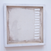
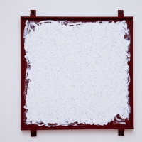
Deidre Adams - VernacularVernacular, 36 x 36 inches, acrylic on panel, ©2012 Deidre Adams

Posting has been quiet here for a while, due to the fact that I’ve been working on revamping my web site and blog. Naturally, this has taken longer than I anticipated, even going by the standard formula for time estimation: multiply by 3 and add 20 minutes. But I didn’t want to let February get by without posting some new work, of which there is quite a lot that I need to photograph and title. I had been in the mood to do another white painting, but somehow the color snuck in at the end – no doubt I’m yearning for spring.

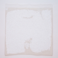
Deidre Adams - Vernacular (detail)Vernacular (detail), ©2012 Deidre Adams
February 29th, 2012|Painting|3 Comments

Robert Ryman – White paint, not white paintings

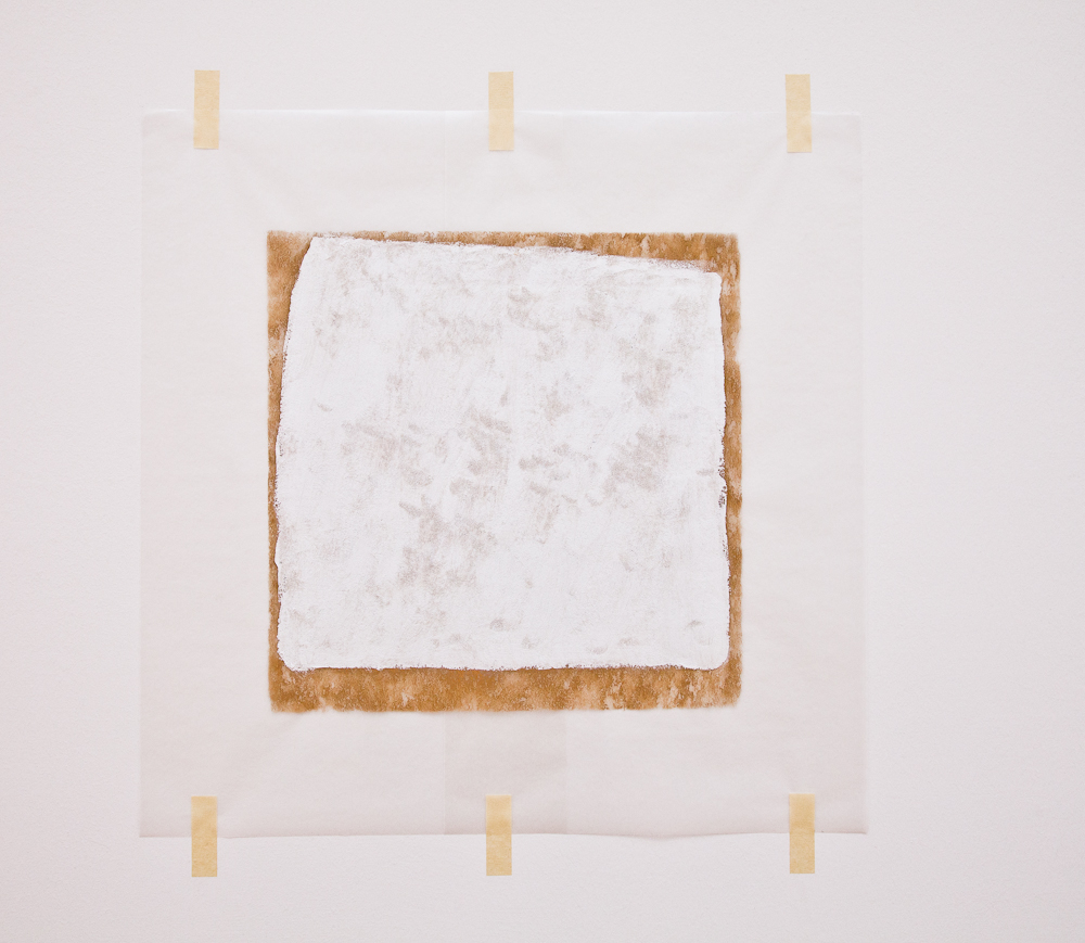
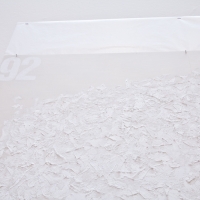
Ryman - Surface Veil

Robert Ryman, Surface Veil, 1970-1971
22 x 29 inches, oil on fiberglass with waxed paper frame and masking tape. Collection SFMOMA.

“The real purpose of painting is to give pleasure.”
–Robert Ryman

When one’s thoughts turn to the topic of white paintings, artist Robert Ryman comes easily to mind. Ryman, born in 1930 in Nashville, was first a jazz musician until he moved to New York in 1952 and subsequently took a job as a vacation relief guard at the Museum of Modern Art. His exposure to the artwork there, including contemporary Americans Jackson Pollock, Willem de Kooning, and Mark Rothko, was instrumental in his decision give up music and turn to painting. He never had any traditional art training, although, as Suzanne P. Hudson recounts in Used Paint1, he was directly influenced by MoMA’s “widespread institutional ethos of experiential learning whereby museum educators … promoted values of thinking and making ‘outside the lines.'” He took one adult course at MoMA in experimental painting, although he would later say he didn’t remember much of it. Other than some life drawing done in the class, he never went through the traditional stages of learning to paint or draw representationally. Instead, he was interested in discovering what could be done with different kinds of paints, substrates, and other materials.

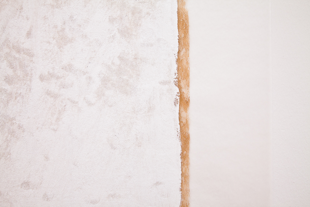
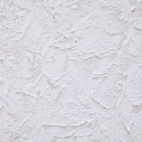
Ryman - Painted Veil (detail)Robert Ryman, Surface Veil (detail)

Although beginning in the mid-1950s he spent many years exclusively making paintings with every type of white paint, using a seemingly limitless variety of techniques on every possible surface, and he is known for work most commonly described reductively as “white squares,” he would say that he was not making white paintings. “I never thought of white as being a color. White could do things that other colors could not do. White has a tendency to make things visible. You can see more of the nuance.”2

Speaking of one of his earliest works, Untitled (Orange Painting), he said in 1992, “I’ve always thought that if I ever wanted to paint a white painting it would be in the order of the way this painting was done, because this is definitely an orange painting but there are many nuances and many oranges (and black and green). And if I were doing a white painting I would approach it the same way, and there would be whites and warm-whites and cold areas and then you would have a white painting. As it is, the way I use white it’s more as a neutral paint, in order to make other things in the painting visible, color for instance.”3

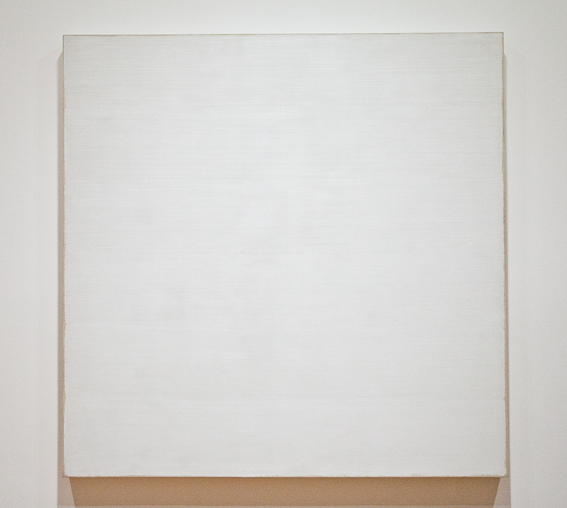
Robert Ryman, TwinRobert Ryman, Twin (1965)
6′ 3 3/4″ x 6′ 3 7/8″ Oil on cotton. Collection New York MoMA.

The interesting thing about Ryman is how he became so well known in spite of (or because of?) his unapologetically unconventional approach to painting. He confounded the critics, who tried variously to categorize his work as minimalist, or anti-form, or process, or conceptualist, while admitting that none of these could be perfectly applied. He resists the idea that his work is abstract, saying “I don’t abstract from anything.

[My work is] involved with real visual aspects of what you really are looking at, whether it’s wood, or you see the paint, and the metal, and how it’s put together and how it works with the wall and how it works with the light.”

Robert Ryman - Untitled (1958)Robert Ryman, Untitled (1958)
10.125 inches square, enamel on linen. Collection SFMOMA.

He also resisted attempts to place him into a specific box or frame within the greater art world. “I’m not involved with any kind of art movement. I’m not a scholar, I’m not a historian. I just look at it as solving problems and working on the painting and the visual experience.”5 There is no attempt at illusion; the paintings are not “about” anything other than what’s right before your eyes. What you see is what you get – nothing more, nothing less.

I read parts of Used Paint a couple of years ago when I was doing research for a school project. It was a treat for me soon thereafter to be able to go to the San Francisco Museum of Modern Art and see some of these paintings in person. They are just what you’d expect, but somehow in person they have a surprising presence. I’m drawn to Ryman’s work aesthetically, and I admire his ability to put forth these seemingly simple objects as paintings and get them hung in the most prestigious of museums. I have an impressive number of partially finished textile works lying around my own studio, suspended from completion because I love the raw edges and I don’t want to cut, bind, or hide them in some “professional” way. If I were Ryman, that would be the end of it – I’d just hand them over to the Guggenheim and up they’d go as is.

Robert Ryman, An all white painting measuring 9 1/2 ” x 10″ and signed twice on the left side in white umber
(See full view here)


I first became aware of Ryman’s work from the wonderful PBS art:21 series. In this video from Season 4 (2007), Ryman demonstrates how his paintings consist not only of the support and the paint, but also the edges, the fasteners, and the wall itself. He tapes panels to the walls with blue painter’s tape, and then paints right over the tape and onto the walls beneath the panels. Then the tape, which has functioned as a resist, is removed. The process is repeated multiple times. This creates a variance in the surface and edge surrounding each panel. The quality of the light in the room is extremely important to the aesthetic experience, including how it changes throughout the day. Speaking about his intention, Ryman says, “It should be a soft, quiet experience that’s nice to look at.”

“In painting, something has to look easy even though it might not be easy.”
“The painting should just be about what it’s about, and not other things.”
“In all of my paintings, I discover things; sometimes I’m surprised at the results6


1Suzanne P. Hudson, Used Paint (October Books, 2009) 7.
The title of the book comes from an anecdote Ryman tells. In 1968, he was to have an exhibition at the Konrad Fischer gallery in Dusseldorf. In order to minimize customs fees, Fischer listed the shipment as “paper” instead of “art.” The customs official said that the duty on handmade paper would be expensive, so Fischer told him it was used, and the paintings were shipped with the designation “Used Paper.” Ryman says, “Since that time I have wondered about the possibility of paintings being defined as ‘Used Paint.’ Then there could be ‘Used Bronze,’ ‘Used Canvas,’ ‘Used Steel,’ ‘Used Lead … ‘”

2Robert Ryman in “Paradox,” segment from PBS series art:21, Season 4.

3Ryman, cited in interviews with Catherine Kinley on April 11, 1992, and Lynn Zelevansky on July 1 and 7, 1992. See Catherine Kinley, Lynn Zelevansky and Robert Ryman, “Catalogue Notes,” in Robert Storr, Robert Ryman (ex. cat., Tate Gallery, London/MoMA, New York, 1993), p. 48, quoted in “The How and the What,” Suzanne Hudson, Flash Art n.263 November-December 09

4Ryman, “Paradox”

5ibid.

6ibid.

January 19th, 2012|Art, Interesting Artists|4 Comments