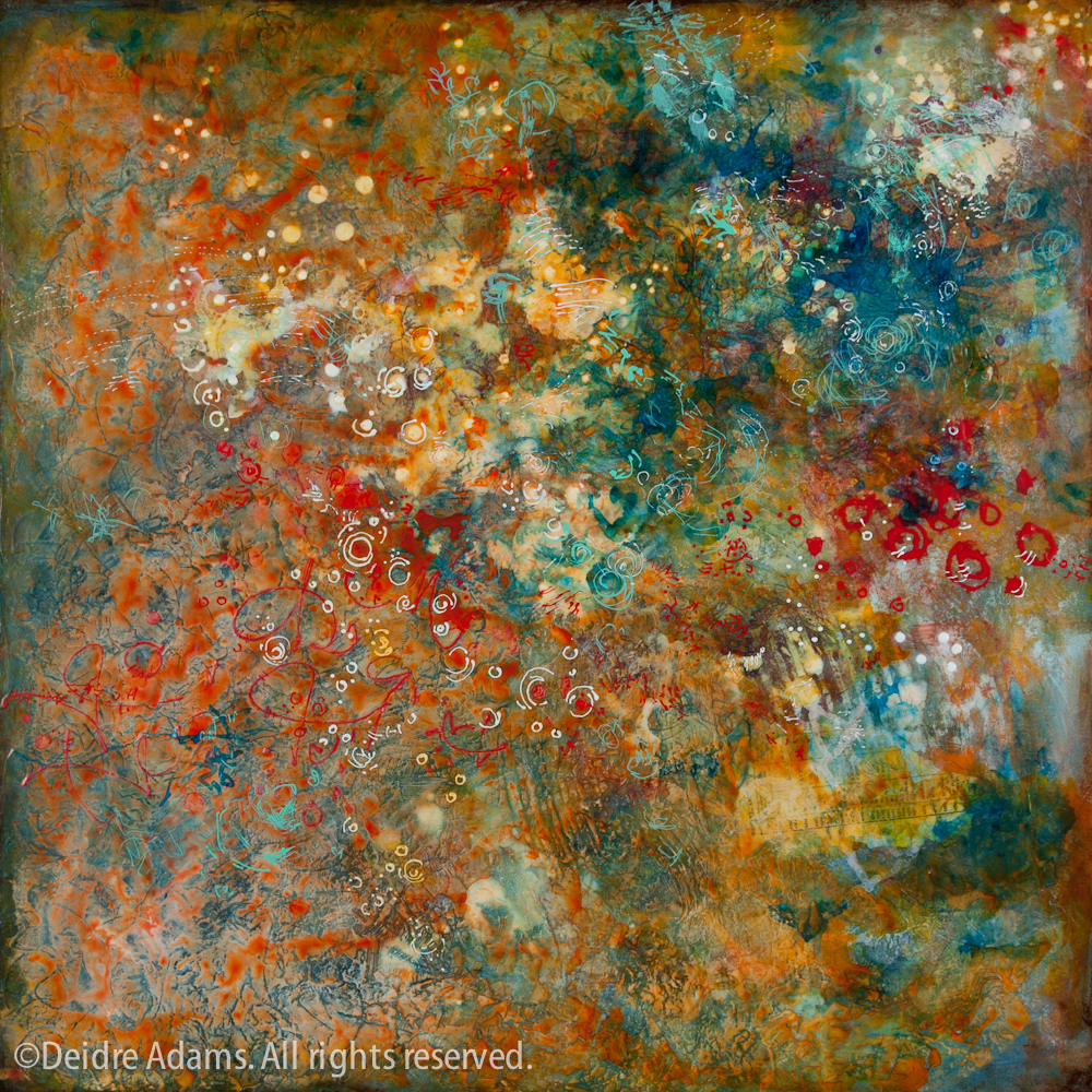
 Organic Compound, 24 x 24 inches, acrylic on panel, ©2010 Deidre Adams
I’m finally calling this painting done. Not that I haven’t already done that – twice – but I kept thinking it needed something more. I went to a meeting of artist friends on Friday night, and the next day, while thinking about a conversation we had with the hostess while considering a painting in her studio, I was inspired to attack my own painting one more time.
My friend had made her painting over the course of a 15-week class in which the students worked on the same painting in each session of the class. I had seen my friend’s painting once before in a much earlier stage, and I was really surprised at how much it had changed by the end – I wouldn’t even have recognized it as the same painting. The final painting was fantastic, but I’d also thought the same thing about the earlier version. I asked her if it had been difficult to paint over parts of the painting that were really working. She talked about how it was part of the process to let go of attachments and learn to forge ahead without fear.
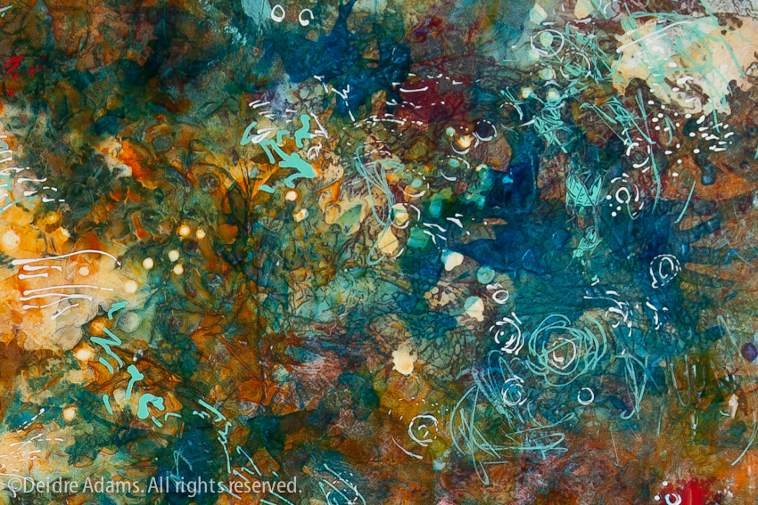
 Organic Compound, detail
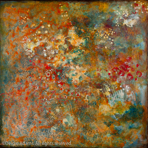
The notion of attachment really resonated with me, as I do have a tendency to fall in love with certain passages in a painting, and then the fear of messing with those keeps me from giving the painting what it needs. The image below shows the last documented state of Organic Compound before the above. I was really happy with the colors and textures, but the composition was just a little too “overall” for me and I felt it needed some punch. So my solution yesterday was to add the darker blue values in the upper right corner, plus the very detailed turquoise markings. In the process, I lost some really nice color and detail in that upper right area, but in my opinion the resulting composition is a lot stronger now.

Organic Compound in progress II
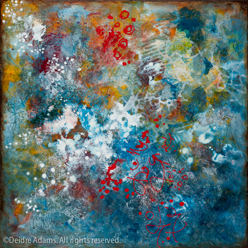
Prior to that, the painting had a very different look. Below you will see how it looked for several months. I was really indecisive about where to go with it, so I just decided to make a drastic change and see where that would lead. I flooded the whole thing with warm reds and oranges, which settled very nicely into the texture and made a more cohesive result. It also changed the balance, so I rotated it one turn. (Topic for future discussion: Those who say you must be decisive in choosing the orientation vs. those who say it’s subject to change.)
Some of you may not agree that what I did was an improvement. Of course it’s my work so I have final say, but I am curious to know what you think.


I like THE last version better than THE one before that, the blue really does THE trick!
I also like THE original one!
I think opinion is objective but since you asked 🙂 I like the painting in the first step /progress 1, It would have pleased me at this point yet disadvantage of only seeing photo not texture. Then I love your final progress of the piece I do think it added the punch and looks complete. (did not feel progress two looked completed)
Thanks for sharing.
I like the change you made. It’s funny that you went back to the blue again, except this time a much stronger blue.
Thanks for putting words to my dilemma. Attachment. It certainly keeps my work from progressing. Here’s to forging ahead without fear.
Organic Compound in progress l and Organic Compound are hardly the same piece, are they? Both interesting to look at. I ‘like’ them both but can’t pick a favorite. One is more layered and one is more unlayered. In progress ll is not interesting by comparison. Really appreciate seeing your process.
Love, LOVE your work btw. I’ve watched it for years.
Thanks, everyone. I should mention that as regards In-Progress I, the photo for some reason looks better than the painting did in life. Although as I’ve said multiple times, when you work abstractly it’s sometimes hard to know when to stop, I think perhaps that may be part of my knowing. If the original painting looks better than the photo, I’m happier than if it’s the other way round.
Fascinating to see the process.
Last year I was blown away seeing Gerhard Richter’s ‘Cage’ series at Tate Modern. The book accompanying the exhibit showed all the stages that the paintings had gone through, in some cases complete colour changes. But it all added to the sense of depth and glimpses of hidden layers that made them so masterful.
I can see some of these qualities in your work here – worth the perseverence!
I definitely like the final painting the best. The red on the original looks a little too dominant to me and the second one seemed unfinished. The final is beautiful.
Then again, I couldn’t do any of what you do, so they are all beautiful!
As a known re-worker of work, I am always for more layers, more daring, more mystery. Beautiful artwork!
Great article. It’s true. Work goes through many phases and sometimes you just have to be patient, understand what you have and then make the decision if have resolved the work. Thank you for the great photos.
Deidre; I have admired your work for sometime. My preference is the blue first one. The reason is that there is more contrast between the dark blue and white. My eye moves around the piece. Whereas the finished work, quite beautiful and more complex in detail, doesn’t move me my eye and has less clarity with less contrast.