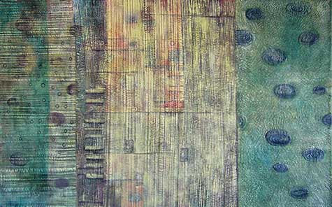
Façade Series

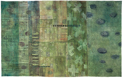
Façade III: Red Oxide

Façade IV: Chrome Oxide
39 x 60 inches

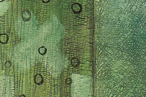
Here is the finished version of the piece I wrote about on Jan. 3. This series is inspired by walls of old buildings which have been painted over numerous times, with the top layers wearing away to reveal what lies beneath; sometimes there’s also graffiti, and all of it blends together to form a rich visual texture. My process in painting these is somewhat analogous to what these walls undergo. I add various elements, then subtract parts of them by adding more layers, while the layers of paint are affected by the physical texture of the underlying support — in my case, it’s fabric and stitching.

This leads into what’s been an ongoing dilemma for me: how to categorize this work. I’ve been calling them “mixed media textiles” because I don’t want to use the dreaded “q” word, and they’re more than paintings. “Quilts” suffer a bad rap in the art world; no matter how serious the artist nor how important the work, the medium is considered a “craft” and is therefore inferior to painting. Thanks to the efforts of many artists in the field and organizations such as SAQA (Studio Art Quilt Associates, Inc.), some progress has been made toward overcoming this image, but the battle isn’t won yet.

Façade III – detail

Façade IV: Chrome Oxide (detail)

January 9th, 2008|Work in progress|Comments Off on Façade Series

Exhibit at Tallyn’s Reach Library

Today was the 4th meeting of my fiber study design group. This group started last August when I was asked to teach a class in design for a group of artists who know one another through various groups and workshops, and who all work in different mediums. I had developed the outline for this design class over a year ago when I was asked to teach by some members of our local art quilt guild, the Front Range Contemporary Quilters. I had been thinking about how quilters and fiber artists often progress in their development by taking lots of workshops and learning from one another. These workshops tend to be mainly focused on techniques, so they know how to use materials and follow a process, but they often have no background in basic principles of design and composition. I knew I didn’t want to just teach yet another technique, so I developed a design class instead. Last August was the third time I have taught it.

The class was originally intended to be 2 days, but this group enjoyed learning about design so much, they wanted to continue on with more study. Each time, I give them homework exercises which they have a couple of months to complete before the next meeting. In today’s class, we looked at what every one had done with the homework, and the results are really amazing. They are all so creative and the different solutions everyone comes up with are truly inspiring. Unfortunately, being new to blogging, I completely forgot to take pictures to include here, even though I had asked them early on if I could. Next time I won’t forget!

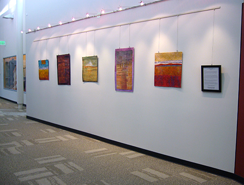
Anyway, the house we met at is very close to a local library where some of my work is currently on display, so I went there after class to get a shot of the exhibit wall. This exhibit, at the Tallyn’s Reach Library, is part of the City of Aurora’s 2007-2008 Art in Public Places program. More of my work is on display at the Martin Luther King, Jr. Library. Starting March 1, the work leaves the libraries and moves to the Aurora Municipal Center.

tallynsreach080105.jpg

January 5th, 2008|Exhibitions|Comments Off on Exhibit at Tallyn’s Reach Library

Getting up to speed

Well, you have to expect that the first few posts are going to be awkward ramblings until the neophyte blogger can find her voice and get into a rhythm. There is so much to learn, and while I am slightly more technical than the average artist, I’m finding this all very bewildering. But my original intention for this journal was to keep it more art-related and try not to wander too far off track with boring details.

So to that end, here’s some art-related content. I’m working on two pieces now that aren’t coming together easily. Sometimes this happens, either because my original vision wasn’t very clear, or because it turned out to be hard to articulate. Let’s just take one of them to discuss for now.

Work from 12/27/07

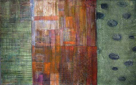
I started the painting on this one a few weeks ago. I had a very clear idea of the colors I wanted to use and how I wanted to divide up the composition, but it just isn’t working at this point. It feels like 3 separate panels, and they aren’t integrated. I like each separate section, but they just don’t make sense together.

To attempt to solve this, I changed the color for the middle section. It became very flat at that point, so I used some dark values to bring out the shapes from the original piecing and make it more dimensional, and I changed some of the values in the vertical sections. It’s still not where I want it to end up, but it’s getting there.

adamsd_071229.jpg

I’ll keep working it at it.

January 3rd, 2008|Work in progress|Comments Off on Getting up to speed