Interpreting imagery, cont’d

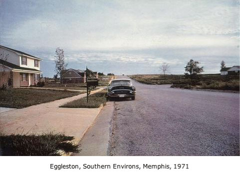
Thanks to everyone who commented about the Eggleston photo. Deb and Wanda, your reactions are similar to mine. Lori, you have a depth of experience and a rich vocabulary for analysis that I aspire to one day! Magsramsay, I’m not sure how big the original is – a quick Google search did not reveal the answer. But I suppose since it was a photograph, he could have printed it fairly small or fairly large, or anywhere in between. We first saw it as a projection on a very large screen in class and then later as a tiny image posted on the web for reference. That’s an interesting point about sizes – I’ve heard that a lot of people are surprised at how small the Mona Lisa is in person.

Well, as I mentioned, I had some anxiety about having to do an interpretation of this photo. The reason was that I just didn’t see what was so special about it. I had seen other work by Eggleston in the past, all of which I thought was a lot more interesting than this particular image. For one example, here’s another one of a comparable subject, but I think the way it’s composed is much more dynamic and engaging. I often find myself in this predicament when looking at art – I think to myself, so here’s this piece in a museum/gallery/arty magazine/whatever; therefore, it must be worthy of my admiration, yet I just don’t see why. I then have to wonder if I’m just lacking in perceptual skills, or whether it’s an emporer’s new clothes kind of thing, where someone of notoriety made it and that alone is enough to make it great. I suppose that in any particular instance, either answer might be right.

So instead of giving in to my first instinct, which was to pretend I found it amazing and write it up as such, I decided to be honest about my thoughts, and it turned out to be a pretty good experience. I’m finding that I’m actually starting to enjoy writing, and it does get easier as you go. My interpretation can be found here.

February 18th, 2008|School|5 Comments

Interpreting imagery

eggleston_southernenvironsmemphis.jpg
One of the reasons I decided to go back to school was to gain a greater understanding of art. I often had a feeling that a lot of it was beyond my grasp and that if I could get a handle on some of the things that other people were trying to do with their art, it would in turn improve my own work. I have a great class this semester called “Understanding Visual Language” which is geared toward just that. Some of it is a little intimidating; the first reading assignment we had was 30 pages of artspeak blah-blah about “primitivism” and “postmodernism” and many other “isms” and “subect vs. object.” Some of the paragraphs are longer than an entire page, and with my short attention span, required re-reading a couple of times before I could fully comprehend them.

But even though participation in the discussions is a big part of the grade, and I’ll be the first to admit that talking in a group is not my strong suit, things have improved substantially since that first reading. We’re now getting into the textbook for the class, called Practices of Looking: An Introduction to Visual Culture, by Marita Sturken and Lisa Cartwright, which I highly recommend because it’s written in a very accessible way and is really quite fascinating. The first chapter is about representation and ideology and how we tend to look at things with preconceived notions based on ideas our particular society accepts as truths, or “givens,” but in actuality are just “myths,” according to French theorist Roland Barthes. Barthes says that “…myth is the hidden set of rules and conventions through which meanings, which are in reality specific to certain groups, are made to seem universal and given for a whole society” (Strunk & Cartwright, 19).

Our first assignment was to write a 2-page interpretation of the above photograph by William Eggleston. Something you should know about Eggleston is that he was the first photographer ever to have a one-person show of color photographs at MOMA in New York. Prior to that, color photography was not seen as art in the same way that black and white was. I was a little worried about this assignment, for reasons I’ll share later, but I am really curious to know what others think of this photograph. If anyone is interested, I’ll post a link to my paper after I see what kind of responses I get.

February 15th, 2008|School|8 Comments

“How long did that take you?”

adams_edificecomplex.jpg

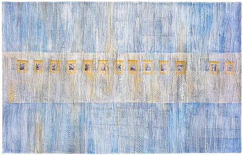
Edifice Complex, 37 x 59 inches, © 2005

My good friend Carol Krueger mentioned the above question in an e-mail conversation the other day, repeating something she had overheard at SOFA Chicago this past November. The speaker went on to say that it seems that this is what Americans always want to know – not what influenced or inspired the artist, as people from other countries might ask, but just how much time did you put into it.

This struck a chord with me, for this is without fail the number one question I am asked whenever the subject of my art comes up with strangers at a show reception or people I know from some other context, such as relatives or co-workers. I try to see it in a positive way, telling myself that this person is taking an interest in my work and just wants to strike up a friendly conversation. But no matter how many times it happens, I’m still taken by surprise. I struggle for an answer, saying that I don’t really know because I work on multiple pieces at one time and don’t track minutes spent on any single one.

The truth is though, that I do find that question just a bit odd. I think however well-intentioned, it tends to devalue the work, making it all about the time spent, as though I could have spent the same amount of time doing anything else at all, even clipping coupons, and derived the same amount of satisfaction out of it. No thought of all the time spent over the years honing my skills and perfecting my technique and doing the unfun stuff like entering shows and making portfolios and other marketing stuff.

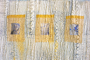
Edifice Complex is one of my personal favorites. I like the subtlety of the color scheme and the simplicity of the composition. This one took me a very long time because I put a lot of piecing into the top and did a lot of extra stitching for the texture.

adams_edificecomplex-det.jpg

Edifice Complex (detail)
February 11th, 2008|Miscellaneous|18 Comments