
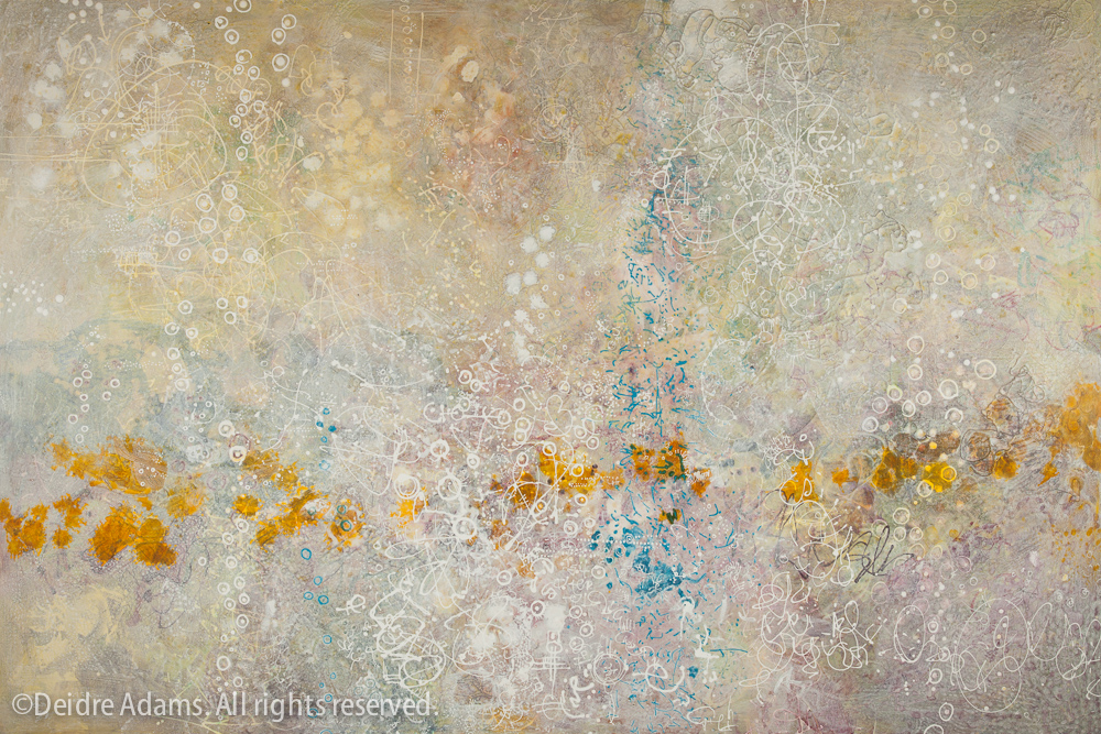
Somniloquence, 48 x 72 inches, acrylic & mixed media on panel – ©2013 Deidre Adams
This is the second painting I was working on concurrently with Suspension of Disbelief. With this one, I remembered to take some in-progress photos as I went. Wish I’d thought to shoot them all from the same direction, but most of the time I don’t decide which way is up until I’m done, and sometimes I’ll even change my mind long after it’s been photographed.
(Update 2/23/13: Found an earlier in-progress shot, below:)
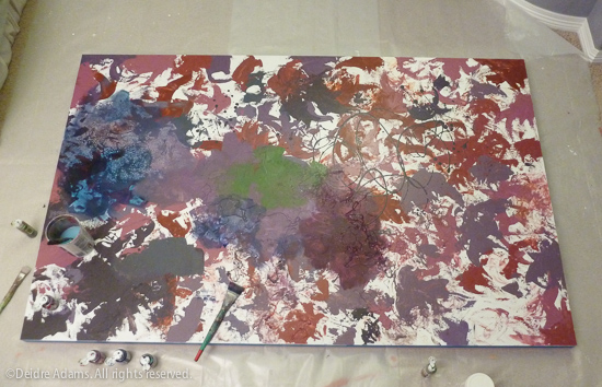
Stage 1 is getting the whole thing covered with color and texture. No plan at this point. Use whatever paint I got on sale, the uglier the better, because it’s all just to get some movement going on here. Good thing I’m neat, because that’s my bedroom carpet under the plastic.
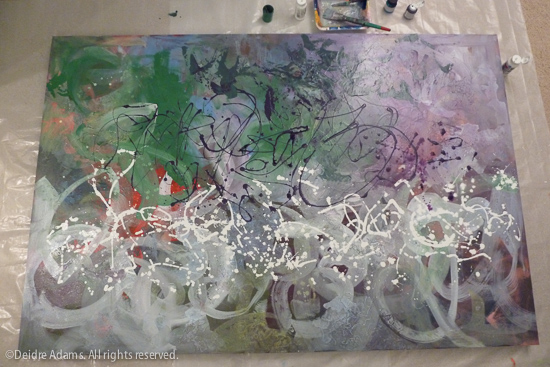
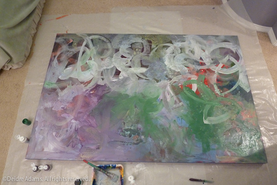
Next stage is to start my “writing” and other markings. This is the most fun part; I lose myself in the process and avoid judging anything too much now. Then I add washes of color. Then more markings, more color washes, with each stage separated by a layer of acrylic medium to build up depth and richness. Each layering of markings, color wash, and medium needs several hours or a day or two to dry in between. I think of this process as similar to to what happens in nature as layers of sand or organic material are deposited on the surface of the earth over time. Some time I think I’ll do a test on a small one and sand back down into it to see what I get. It would be fun to remember all the old colors that are down in there.

Now I have to start making some choices about color. I can’t really explain to you how I choose colors, other than to say that at earlier stages I’m picking colors I don’t really like all that much because I don’t want to be tempted to stop too early. It could be argued that the painting at this stage was more exciting than the finished result, but I had it in mind that I was going for something quieter. All of these bright colors were meant to give the finished painting a richness, and not to be a major feature of it.
Here are some details:
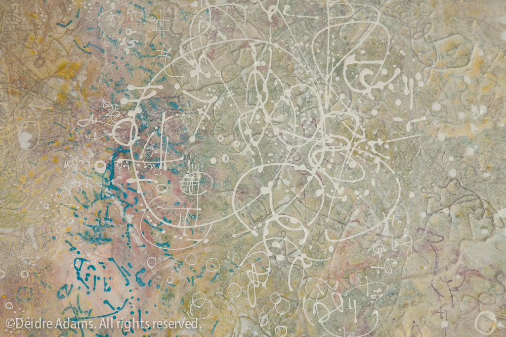

I think of it as a sort of landscape of the mind – at least my own mind, which has a tendency to go wild in unproductive ways until I force myself to stop and focus. (This seems to be getting more difficult the older I get. I blame the Internet.) The quieting down of the crazy color could be analogous to meditation. As you can see, I’m not so good at that yet.
Amazing. Love these.
luscious… wish I could see it in person…