
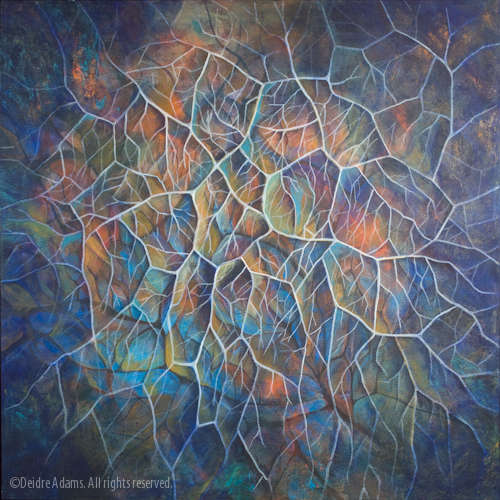
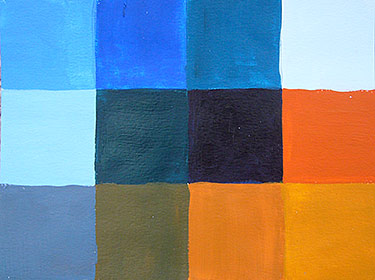
Channeling. 48 x 48 inches, acrylic on canvas. ©2008 Deidre Adams.
The second assignment was called “Abstracted Landscape.” The instructor also referred to this as a “subjective” landscape. We were to abstract a particular landscape of our choice, but also to explore a concept as it relates to abstractions of landscape. However, the water was muddied by this direction:
Look into schools of scientific thought such as geology, geography, physics or mathematics (geometry). For example, scientists have proven that nature grows in patterns (the Fibonacci Sequence, DNA). Create the patterns in nature as exhibited in trees, water, rocks, plants, etc. Or, you may wish to explore artistic/philosophical movements such as Transcendentalism or Shintoism.
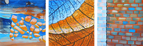
I never quite got to the point of being able to reconcile this concept with the idea of landscape, so in the interest of getting something done in a timely fashion, I just went for abstraction. This came shortly after my trip to Traverse City in September, and I had some great photos from that trip, specifically from a visit to the derelict Traverse City State Hospital. I still need to do an entire post about that place, but one of its many offerings of fantastic weathered surfaces was a brick wall with some exceptional cracking paint patterns.
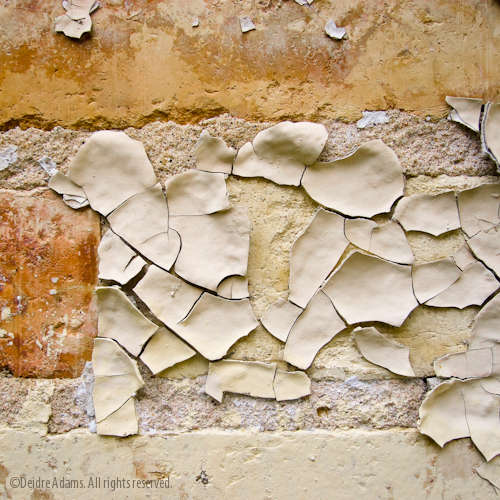
©2008 Deidre Adams.
But, while I was very interested in doing something related to cracking patterns, I had no idea how to go about finding areas of scientific research related to them. So I started looking into nature-related topics, and because I was already thinking about these shapes, I realized that vein patterns in some leaves make enclosed shapes that are very similar to the shapes formed by patterns of cracks in weathered paint.
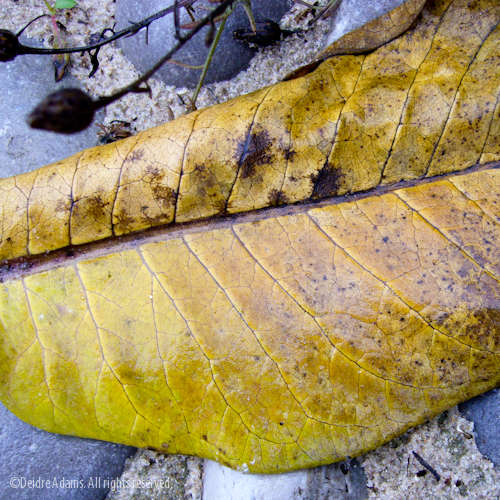
©2008 Deidre Adams.
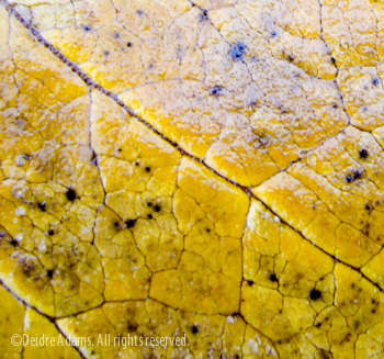
I wondered if there is some kind of scientific reason for this, but it’s kind of hard to research something if you have no idea what that something might be called. So I found a lot of very technical information about leaves and venation patterns, but nothing that answered my question.
Then, to make the assignment even more specific, we had to collect examples of abstract painting and choose a particular painting to take the colors from (not necessarily in the same proportions as the original). My color chart:
We had to do preliminary painting “sketches” for every assignment. I found these rather difficult, as I took way too much time in doing them, far too painstakingly. I think the idea was just to go for placement, value, and color, but I never could get the habit of just scratching them out fast. Especially in acrylic, which takes a lot of mixing to get a specific color. For later assignments, I started doing the sketches in watercolor; that helped me to loosen up considerably. Also, when I work abstractly, my process is not to try to recreate something specifically, but rather to put some things on, study them for a while, then cover up parts, add parts, etc., in an intuitive manner. Even when I do start with a sketch, the finished product is always quite different. Anyway, these are the sketches I made for this painting: Somewhat overworked, too literal, and not terribly interesting.
In working on the final painting, I did revert back to my old ways of working as described. So even through the sketches weren’t really useful to this painting in a direct way, they do force me to get some extra painting practice in. I’m not sure if I will continue to do this as a habit or not. My way — and I’m definitely not saying this is a virtue — is to just get in there and put the paint on, and not agonize too much on meeting a predetermined objective.
As I worked on the painting, I was concentrating on creating the shapes that are formed by spaces within the veins/cracks rather than painting the lines that form their boundaries. I also wanted a layering effect and not something with a direct reference to the source. But it was lacking something, and so I put in the white lines. This made it more lively, but the end product reads more like tree roots than leaf veins, which was not my intention. This happened as I started putting in shading to make different areas stand out and it became dimensional.
As far as the final painting, I think I’m not really satisfied with the colors. They seem too vivid for my taste. If I get inspired, I might go back and muddy things up a little.
I knew exactly where you were headed with the top painting! I like the white lines to help define the interiors, but I spent most of my time looking at the inside of the shapes and across the changes of color.
From what I remember from my college career in Geology, the mud cracks and the leaf veining are very similar because they are a kind of lowest energy tiling shape. Bees use a hexagonal tiling for much the same reasons, and when basalt cools slowly and evenly it forms columnar jointing which is roughly hexagonal.
I, for one, love the vivid color. It is a very warm piece, even your blues are warm. I believe part of your aversion to vivid color is due to the weathered look of your chosen subject matter of peeling paint, old roadside buildings, etc. Everything tends to be a little bleached and a little washed out in many of your photographs, because that’s what nature has done to them over the decades.
Nonetheless, I fully approve of redesigning nature to be more idealized, and thus love your painting. It would make a beautiful quilt design.
Lee, thanks so much for the clue to the science mystery. Off to look that up now! I’m embarrassed to admit that I’m very weak in science knowledge, even though it can be very useful for generating ideas. And besides, shouldn’t we just make an effort to learn everything we can to become well-rounded human beings?
Robert, I’m sure you’re right. I’m spending so much time looking at old faded stuff that intense color just feels kind of wrong at the moment. I’m also working on editing a bunch of digital photos for my web site re-do. I’m finding that the first thing I do is decrease the saturation without hesitation. It helps me to see through the clutter and I think I’m maybe even starting to develop a style!