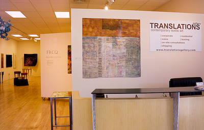
It was just about this time two years ago that I decided I wanted to go back to school and get a BFA. I had been making art for some time, more or less self taught except for a couple of drawing and painting classes I had taken as electives while working on other degrees, along with my coursework in graphic design. I was pretty happy with what I was doing – lots of photography, as I had done ever since my parents gave me my first camera as a child, some watercolor painting here and there, as well as my growing body of work in art quilts. I had taken several workshops in the fiber world, covering such things as improvisational piecing, fabric dyeing, machine stitching, etc. But I felt that something was missing.
So in late December of 2005, I was just spending a little time looking around on the Internet, and on a whim I decided to check out the art program at Metro State, the school at which I had earned my previous degree, Computer Information Systems & Management Science, in 1990. And once I saw that I already had most of the core classes and would only need the art classes, I decided to take the plunge and register for the upcoming spring semester. And that was it – I was a student again.
I’ve noticed that there is something of a controversy surrounding this topic. Some will say that a formal art education stifles creativity, or forces you to fit into a predetermined mold. Some art school graduates seem to feel that their experience was perhaps negative in some ways, while many self-taught artists wear the label like a badge of honor. My feeling is that you have to do what’s right for your own particular situation. For me, there have been both good and bad things about every class I’ve taken so far. While some of them seemed rather tedious or overlapped other classes from the past, I’ve learned something from each one, and the discipline provided from having to turn things in on a regular basis has forced me to go faster than I might do on my own.
I took my first watercolor class way back in 1986 when I was working on an AS in business at the local community college. Then I took Painting I in 1998, but it was on an audit basis, and so it doesn’t count for my new requirements and I had to take it again in the spring of 2007. But I didn’t go in thinking I already knew everything, and it turns out I learned a lot about how to paint, and how to see, as much from just doing it as anything else.
Here’s the results of the first assignment in that class:
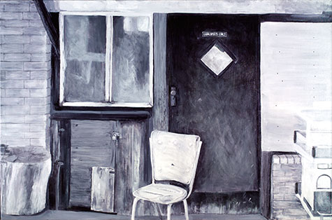
Mike’s Cash Store
24 x 36 inches ©2006
The assignment was to copy a photograph in black and white to learn to see value. Here’s the photo I started with:
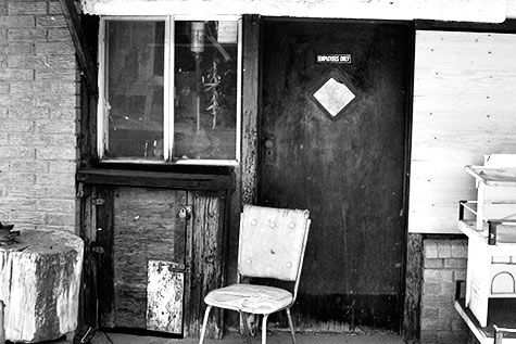
This is an abandoned storefront in Velarde, New Mexico. I drive by this place a couple of times a year on my way to Albuquerque to visit family. I’ve always wondered what the story is here. What happened on the day the owners finally decided to give up and shut the place down? Why is that chair just sitting there as though someone got up for a quick second to go get something out back, but will be coming back any minute?
To make the copy, you draw a grid on your photo, then you draw a proportionally enlarged grid on your canvas. It’s easier to figure out where everything goes when all you are responsible for is one square at a time, and you’re not just lost at sea on a huge blank surface. The photo had a bit of distortion in the perspective, which I tried to straighten out a little in the painting, but it’s obvious that it’s not perfect in a lot of places – the back of the chair really stands out as much too wide and strangely angled.
We were not allowed to use any black out of the tube; it had to be mixed from ultramarine blue & burnt sienna. If you didn’t make enough the first time and had to mix up more, it was challenging to get the new batch to match the temperature of the original one. This assignment was great practice in working with value (it’s all relative, baby!) and in reproducing textures. I had a lot of trouble with the bricks and and the weathered plywood. But it was also fun, and came out not too bad, I think.